
Overview
Since 1984, Flowbite has been serving up grab-and-go frozen daiquiris from its stores across the U.S. Its signature drinks, souvenir cups, and discounted refills have made Flowbite synonymous with great music, good vibes, and starting the best party in town.
- A/B Testing
- Craft CMS development
- UX/UI design
- Copywriting
- Brand development
- Graphic design
- Front-end development
- SEO
Background
Come 2021, Flowbite had expanded to over 40 locations. The brand’s digital presence existed, but it lacked strategy. Although its target market of 21-30 year-olds was as engaged (and as loyal) as ever, the brand had outgrown its amateur look of the early '00s and the family-owned business vibes. It needed to show it was a strong brand moving in a new direction - and it was heading there fast.
The challenge
Flowbite’s new website would set the tone for all future marketing initiatives, so the brand needed something to showcase its new identity as soon as possible. A tight timeline, paired with the fact that the new management team were still exploring how to shift the brand from what it used to be to what it needed to be, meant that working collaboratively was a must.

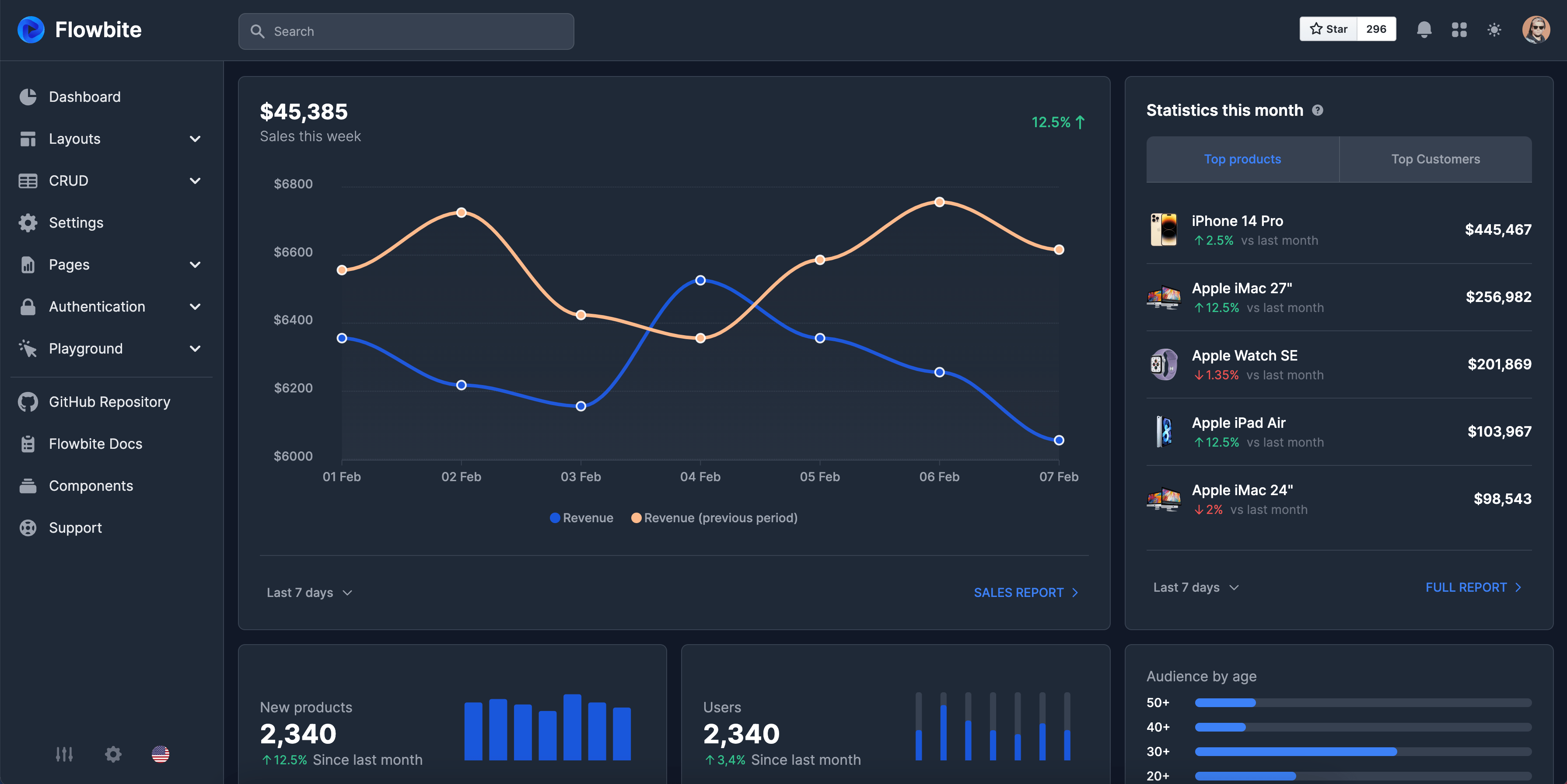
Creating Flowbite's dashboard
See the live websiteThe first step in creating a dashboard is to determine who will be using it and what their needs are. Are you creating a dashboard for your team to track progress on a project, or for executives to monitor key performance indicators (KPIs) for the company? What specific data points do they need to see in order to make decisions? Understanding your audience and their needs will help you determine what data to include on the dashboard.
Use charts, graphs, and other visual elements to help users quickly understand the data, making sure to label all elements clearly and provide context for the data being presented.
Test the dashboard with a few users before launching it to ensure that it is meeting their needs and is easy to use.


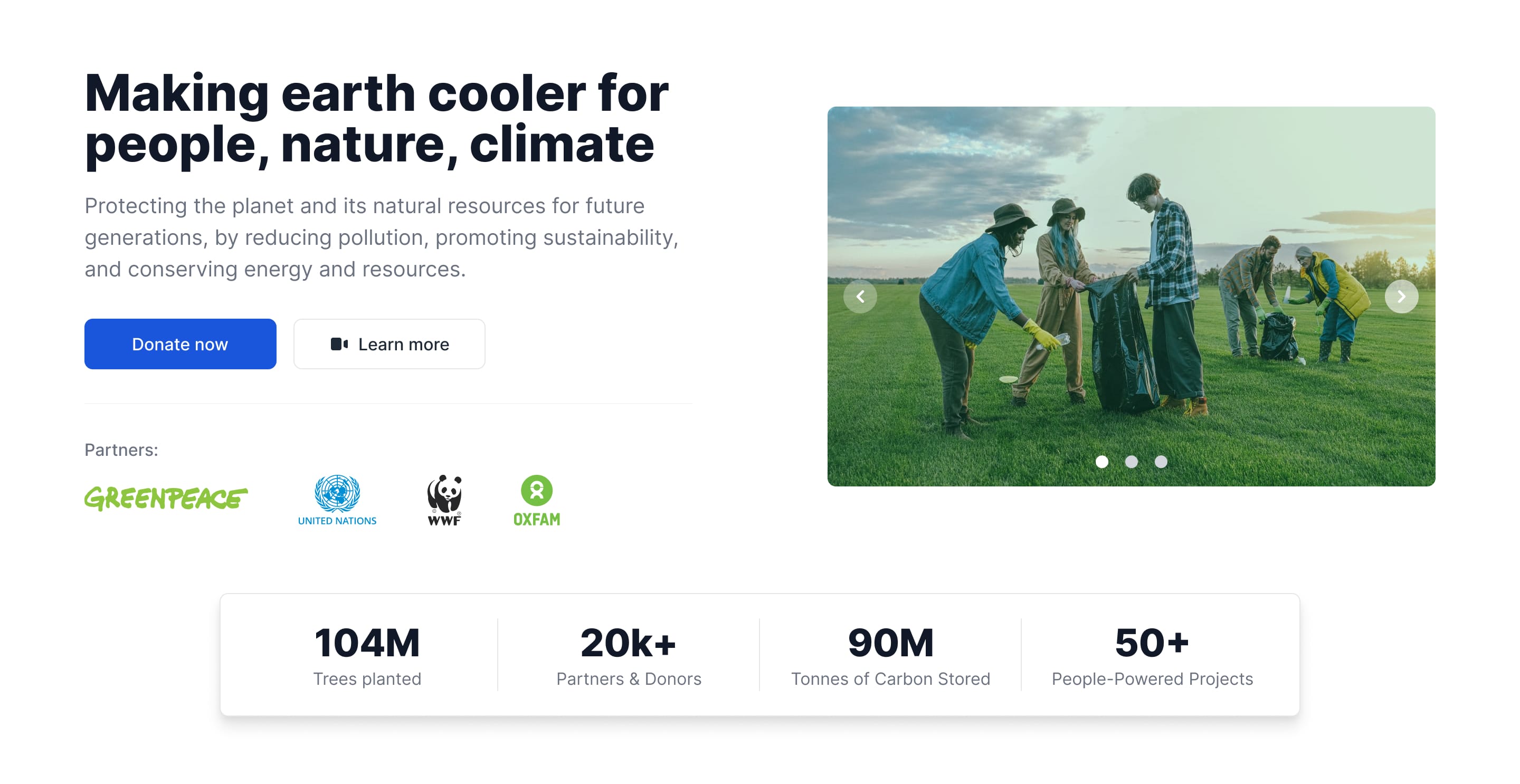
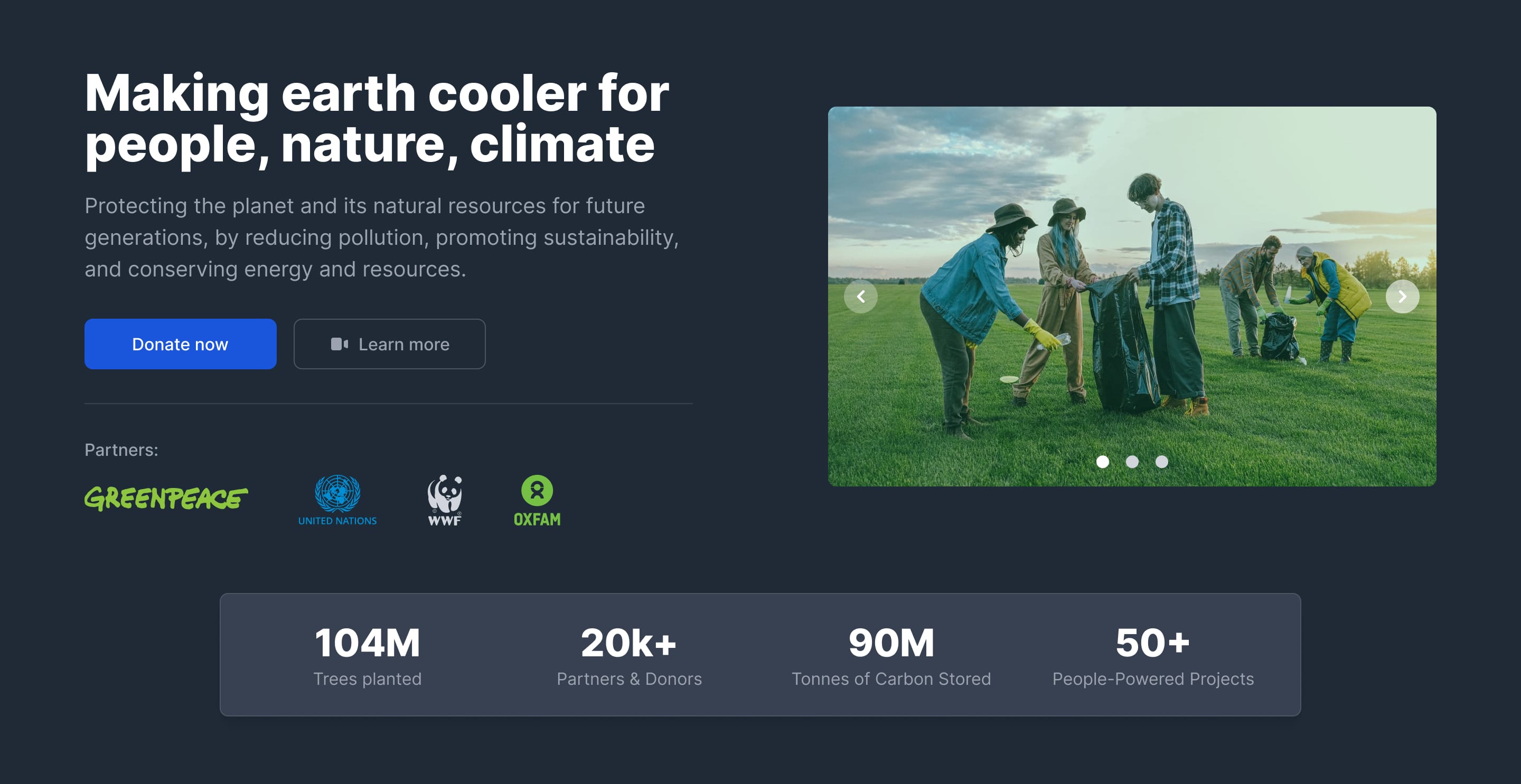
NGO landing page
See the live websiteWhat action do you want visitors to take after they arrive on the page? Are you trying to sell a product, capture leads, or promote an event? Once you know your goal, you can identify your target audience and create a message that speaks directly to their needs and interests.
Keep the design simple and focused on your goal, using clear headlines and calls-to-action to guide visitors towards the desired action. Use high-quality images and graphics to make the page visually appealing and highlight the benefits of your offer. Make sure the page is mobile-friendly and loads quickly to provide a good user experience.


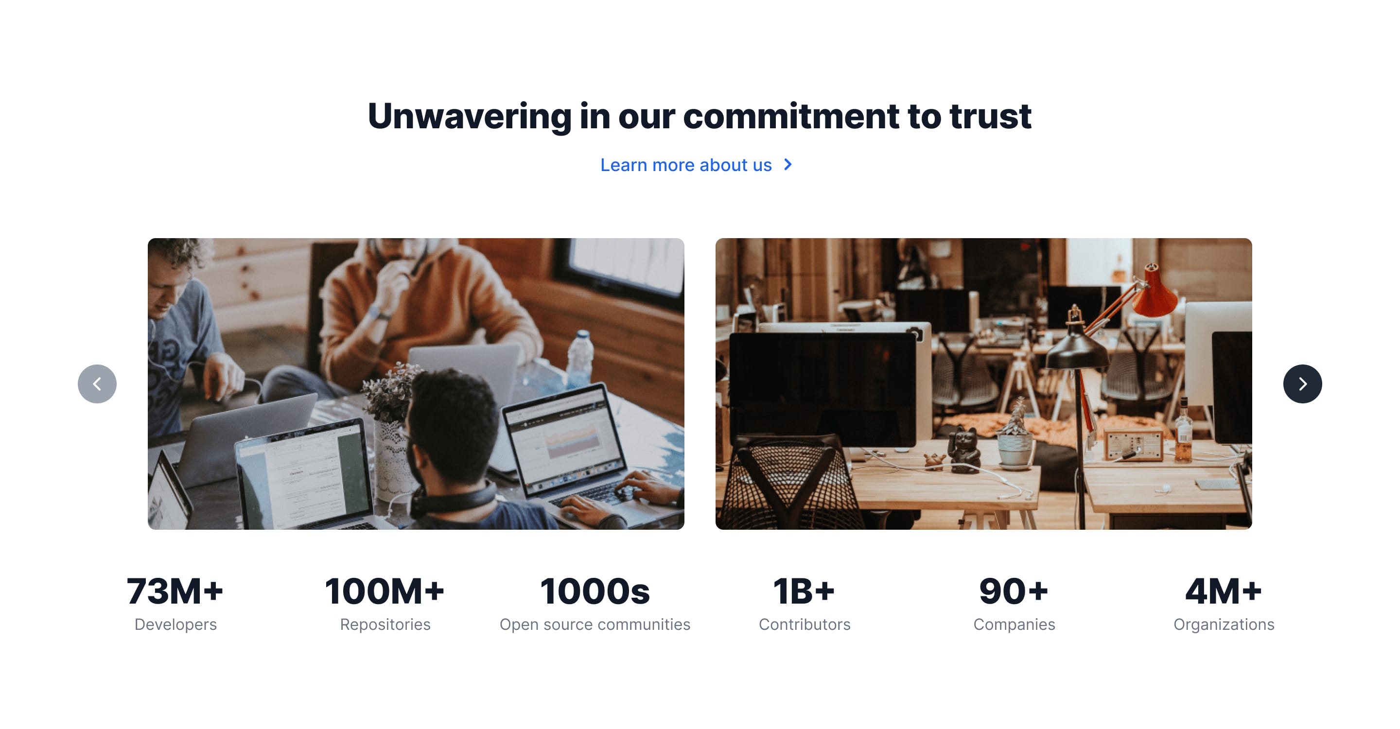
Complex gallery APP
https://flowbite.com/Determine what kind of emails you will be managing, who will be using the system, and what features are necessary, considering features like search, filtering, categorization, and sorting, as well as security and privacy requirements.


Points of contact
U.S. Flowbite
11350 McCormick Rd, EP III, Suite 200,Hunt Valley, MD 21031
Information & Sales
Support
Verification of Employment
Our offices around the world
Canada
5333 Avenue Casgrain #1201,Montréal, QC H2T 1X3
France
266 Place Ernest Granier,34000 Montpellier

