Tailwind CSS Cards - Flowbite
Get started with a large variety of Tailwind CSS card examples for your web project
Use these responsive card components to show data entries and information to your users in multiple forms and contexts such as for your blog, application, user profiles, and more.
Default card #
Use the following simple card component with a title and description.
<a href="#" class="bg-neutral-primary-soft block max-w-sm p-6 border border-default rounded-base shadow-xs hover:bg-neutral-secondary-medium">
    <h5 class="mb-3 text-2xl font-semibold tracking-tight text-heading leading-8">Noteworthy technology acquisitions 2021</h5>
    <p class="text-body">Here are the biggest technology acquisitions of 2025 so far, in reverse chronological order.</p>
</a>
Card with button #
Use the following example of a card element if you also want to have an action button.
Noteworthy technology acquisitions 2021
Here are the biggest technology acquisitions of 2025 so far, in reverse chronological order.
Read more<div class="bg-neutral-primary-soft block max-w-sm p-6 border border-default rounded-base shadow-xs">
<h5 class="mb-3 text-2xl font-semibold tracking-tight text-heading leading-8">Noteworthy technology acquisitions 2021</h5>
<p class="text-body mb-6">Here are the biggest technology acquisitions of 2025 so far, in reverse chronological order.</p>
<a href="#" class="inline-flex items-center text-white bg-brand box-border border border-transparent hover:bg-brand-strong focus:ring-4 focus:ring-brand-medium shadow-xs font-medium leading-5 rounded-base text-sm px-4 py-2.5 focus:outline-none">
Read more
<svg class="w-4 h-4 ms-1.5 rtl:rotate-180 -me-0.5" aria-hidden="true" xmlns="http://www.w3.org/2000/svg" width="24" height="24" fill="none" viewBox="0 0 24 24"><path stroke="currentColor" stroke-linecap="round" stroke-linejoin="round" stroke-width="2" d="M19 12H5m14 0-4 4m4-4-4-4"/></svg>
</a>
</div>
Card with link #
This example can be used to show a CTA as a link instead of a button inside the card.
Need a help in Claim?
Go to this step by step guideline process on how to certify for your weekly benefits:
See our guideline<div class="bg-neutral-primary-soft block max-w-sm p-6 border border-default rounded-base shadow-xs">
<svg class="w-7 h-7 mb-3 text-body" aria-hidden="true" xmlns="http://www.w3.org/2000/svg" width="24" height="24" fill="none" viewBox="0 0 24 24"><path stroke="currentColor" stroke-linecap="round" stroke-linejoin="round" stroke-width="2" d="M10 21v-9m3-4H7.5a2.5 2.5 0 1 1 0-5c1.5 0 2.875 1.25 3.875 2.5M14 21v-9m-9 0h14v8a1 1 0 0 1-1 1H6a1 1 0 0 1-1-1v-8ZM4 8h16a1 1 0 0 1 1 1v3H3V9a1 1 0 0 1 1-1Zm12.155-5c-3 0-5.5 5-5.5 5h5.5a2.5 2.5 0 0 0 0-5Z"/></svg>
<a href="#">
<h5 class="mb-2 text-2xl font-semibold tracking-tight text-heading">Need a help in Claim?</h5>
</a>
<p class="mb-3 text-body">Go to this step by step guideline process on how to certify for your weekly benefits:</p>
<a href="#" class="inline-flex font-medium items-center text-fg-brand hover:underline">
See our guideline
<svg class="w-4 h-4 ms-2 rtl:rotate-[270deg]" aria-hidden="true" xmlns="http://www.w3.org/2000/svg" width="24" height="24" fill="none" viewBox="0 0 24 24"><path stroke="currentColor" stroke-linecap="round" stroke-linejoin="round" stroke-width="2" d="M18 14v4.833A1.166 1.166 0 0 1 16.833 20H5.167A1.167 1.167 0 0 1 4 18.833V7.167A1.166 1.166 0 0 1 5.167 6h4.618m4.447-2H20v5.768m-7.889 2.121 7.778-7.778"/></svg>
</a>
</div>
Card with image #
You can use the following example of a card element with an image for blog posts, user cards, and many more.
<div class="bg-neutral-primary-soft block max-w-sm border border-default rounded-base shadow-xs">
    <a href="#">
        <img class="rounded-t-base" src="/docs/images/blog/image-1.jpg" alt="" />
    </a>
    <div class="p-6 text-center">
        <span class="inline-flex items-center bg-brand-softer border border-brand-subtle text-fg-brand-strong text-xs font-medium px-1.5 py-0.5 rounded-sm">
            <svg class="w-3 h-3 me-1" aria-hidden="true" xmlns="http://www.w3.org/2000/svg" width="24" height="24" fill="none" viewBox="0 0 24 24"><path stroke="currentColor" stroke-linecap="round" stroke-linejoin="round" stroke-width="2" d="M18.122 17.645a7.185 7.185 0 0 1-2.656 2.495 7.06 7.06 0 0 1-3.52.853 6.617 6.617 0 0 1-3.306-.718 6.73 6.73 0 0 1-2.54-2.266c-2.672-4.57.287-8.846.887-9.668A4.448 4.448 0 0 0 8.07 6.31 4.49 4.49 0 0 0 7.997 4c1.284.965 6.43 3.258 5.525 10.631 1.496-1.136 2.7-3.046 2.846-6.216 1.43 1.061 3.985 5.462 1.754 9.23Z"/></svg>
            Trending
        </span>
        <a href="#">
            <h5 class="mt-3 mb-6 text-2xl font-semibold tracking-tight text-heading">Streamlining your design process today.</h5>
        </a>
        <a href="#" class="inline-flex items-center text-white bg-brand box-border border border-transparent hover:bg-brand-strong focus:ring-4 focus:ring-brand-medium shadow-xs font-medium leading-5 rounded-base text-sm px-4 py-2.5 focus:outline-none">
            Read more
            <svg class="w-4 h-4 ms-1.5 rtl:rotate-180 -me-0.5" aria-hidden="true" xmlns="http://www.w3.org/2000/svg" width="24" height="24" fill="none" viewBox="0 0 24 24"><path stroke="currentColor" stroke-linecap="round" stroke-linejoin="round" stroke-width="2" d="M19 12H5m14 0-4 4m4-4-4-4"/></svg>
        </a>
    </div>
</div>
Card with description #
Use this alternative styled card with an image for features, blog posts, and more.
Streamlining your design process today.
In today’s fast-paced digital landscape, fostering seamless collaboration among Developers and IT Operations.
Read more<div class="bg-neutral-primary-soft block max-w-sm p-6 border border-default rounded-base shadow-xs">
<a href="#">
<img class="rounded-base" src="/docs/images/blog/image-1.jpg" alt="" />
</a>
<a href="#">
<h5 class="mt-6 mb-2 text-2xl font-semibold tracking-tight text-heading">Streamlining your design process today.</h5>
</a>
<p class="mb-6 text-body">In today’s fast-paced digital landscape, fostering seamless collaboration among Developers and IT Operations.</p>
<a href="#" class="inline-flex items-center text-body bg-neutral-secondary-medium box-border border border-default-medium hover:bg-neutral-tertiary-medium hover:text-heading focus:ring-4 focus:ring-neutral-tertiary shadow-xs font-medium leading-5 rounded-base text-sm px-4 py-2.5 focus:outline-none">
Read more
<svg class="w-4 h-4 ms-1.5 rtl:rotate-180 -me-0.5" aria-hidden="true" xmlns="http://www.w3.org/2000/svg" width="24" height="24" fill="none" viewBox="0 0 24 24"><path stroke="currentColor" stroke-linecap="round" stroke-linejoin="round" stroke-width="2" d="M19 12H5m14 0-4 4m4-4-4-4"/></svg>
</a>
</div>
Horizontal card #
If you want to spice up your cards you can use the following card which has its child elements aligned horizontally.
<a href="#" class="flex flex-col items-center bg-neutral-primary-soft p-6 border border-default rounded-base shadow-xs md:flex-row md:max-w-xl md:flex-row md:max-w-xl">
    <img class="object-cover w-full rounded-base h-64 md:h-auto md:w-48 mb-4 md:mb-0" src="/docs/images/blog/image-4.jpg" alt="">
    <div class="flex flex-col justify-between md:p-4 leading-normal">
        <h5 class="mb-2 text-2xl font-bold tracking-tight text-heading">Streamlining your design process today.</h5>
        <p class="mb-6 text-body">In today’s fast-paced digital landscape, fostering seamless collaboration among Developers and IT Operations.</p>
        <div>
            <button type="button" class="inline-flex items-center w-auto text-body bg-neutral-secondary-medium box-border border border-default-medium hover:bg-neutral-tertiary-medium hover:text-heading focus:ring-4 focus:ring-neutral-tertiary shadow-xs font-medium leading-5 rounded-base text-sm px-4 py-2.5 focus:outline-none">
                Read more
                <svg class="w-4 h-4 ms-1.5 rtl:rotate-180 -me-0.5" aria-hidden="true" xmlns="http://www.w3.org/2000/svg" width="24" height="24" fill="none" viewBox="0 0 24 24"><path stroke="currentColor" stroke-linecap="round" stroke-linejoin="round" stroke-width="2" d="M19 12H5m14 0-4 4m4-4-4-4"/></svg>
            </button>
        </div>
    </div>
</a>
User profile card #
Use this user profile card example if you want to show a dropdown menu and buttons to enable multiple actions from your user.

Bonnie Green
Visual Designer<div class="relative bg-neutral-primary-soft max-w-xs w-full p-6 border border-default rounded-base shadow-xs">
<button id="dropdownButton" data-dropdown-toggle="dropdown" class="absolute top-2 end-2 text-body hover:text-heading bg-neutral-primary-soft box-border border border-transparent hover:bg-neutral-tertiary focus:ring-4 focus:ring-neutral-tertiary rounded-base p-1.5 focus:outline-none" type="button">
<span class="sr-only">Open dropdown</span>
<svg class="w-6 h-6" aria-hidden="true" xmlns="http://www.w3.org/2000/svg" width="24" height="24" fill="none" viewBox="0 0 24 24"><path stroke="currentColor" stroke-linecap="round" stroke-width="3" d="M6 12h.01m6 0h.01m5.99 0h.01"/></svg>
</button>
<!-- Dropdown menu -->
<div id="dropdown" class="z-10 bg-neutral-primary-medium border border-default-medium rounded-base shadow-lg w-36 block hidden">
<ul class="p-2 text-sm text-body font-medium" aria-labelledby="dropdownButton">
<li>
<a href="#" class="inline-flex items-center w-full p-2 hover:bg-neutral-tertiary-medium hover:text-heading rounded-md">Edit</a>
</li>
<li>
<a href="#" class="inline-flex items-center w-full p-2 hover:bg-neutral-tertiary-medium hover:text-heading rounded-md">Export Data</a>
</li>
<li>
<a href="#" class="inline-flex items-center w-full p-2 text-fg-danger hover:bg-neutral-tertiary-medium rounded-md">Delete</a>
</li>
</ul>
</div>
<div class="flex flex-col items-center">
<img class="w-24 h-24 mb-6 rounded-full" src="/docs/images/people/profile-picture-3.jpg" alt="Bonnie image"/>
<h5 class="mb-0.5 text-xl font-semibold tracking-tight text-heading">Bonnie Green</h5>
<span class="text-sm text-body">Visual Designer</span>
<div class="flex mt-4 md:mt-6 gap-4">
<button type="button" class="inline-flex items-center text-white bg-brand box-border border border-transparent hover:bg-brand-strong focus:ring-4 focus:ring-brand-medium shadow-xs font-medium leading-5 rounded-base text-sm px-4 py-2.5 focus:outline-none">
<svg class="w-4 h-4 me-1.5 -ms-0.5" aria-hidden="true" xmlns="http://www.w3.org/2000/svg" width="24" height="24" fill="none" viewBox="0 0 24 24"><path stroke="currentColor" stroke-linecap="round" stroke-linejoin="round" stroke-width="2" d="M16 12h4m-2 2v-4M4 18v-1a3 3 0 0 1 3-3h4a3 3 0 0 1 3 3v1a1 1 0 0 1-1 1H5a1 1 0 0 1-1-1Zm8-10a3 3 0 1 1-6 0 3 3 0 0 1 6 0Z"/></svg>
Follow me
</button>
<button type="button" class="inline-flex self-start w-auto text-body bg-neutral-secondary-medium box-border border border-default-medium hover:bg-neutral-tertiary-medium hover:text-heading focus:ring-4 focus:ring-neutral-tertiary shadow-xs font-medium leading-5 rounded-base text-sm px-4 py-2.5 focus:outline-none">
Message
</button>
</div>
</div>
</div>
Card with form inputs #
Use this card example where you can add form input elements that can be used for authentication actions or any other context where you need to receive information from your users.
<div class="w-full max-w-sm bg-neutral-primary-soft p-6 border border-default rounded-base shadow-xs">
    <form action="#">
        <h5 class="text-xl font-semibold text-heading mb-6">Sign in to our platform</h5>
        <div class="mb-4">
            <label for="email" class="block mb-2.5 text-sm font-medium text-heading">Your email</label>
            <input type="email" id="email" class="bg-neutral-secondary-medium border border-default-medium text-heading text-sm rounded-base focus:ring-brand focus:border-brand block w-full px-3 py-2.5 shadow-xs placeholder:text-body" placeholder="example@company.com" required />
        </div>
        <div>
            <label for="password" class="block mb-2.5 text-sm font-medium text-heading">Your password</label>
            <input type="password" id="password" class="bg-neutral-secondary-medium border border-default-medium text-heading text-sm rounded-base focus:ring-brand focus:border-brand block w-full px-3 py-2.5 shadow-xs placeholder:text-body" placeholder="•••••••••" required />
        </div>
        <div class="flex items-start my-6">
            <div class="flex items-center">
                <input id="checkbox-remember" type="checkbox" value="" class="w-4 h-4 border border-default-medium rounded-xs bg-neutral-secondary-medium focus:ring-2 focus:ring-brand-soft">
                <label for="checkbox-remember" class="ms-2 text-sm font-medium text-heading">Remember me</label>
            </div>
            <a href="#" class="ms-auto text-sm font-medium text-fg-brand hover:underline">Lost Password?</a>
        </div>
        <button type="submit" class="text-white bg-brand box-border border border-transparent hover:bg-brand-strong focus:ring-4 focus:ring-brand-medium shadow-xs font-medium leading-5 rounded-base text-sm px-4 py-2.5 focus:outline-none w-full mb-3">Login to your account</button>
        <div class="text-sm font-medium text-body">Not registered? <a href="#" class="text-fg-brand hover:underline">Create account</a></div>
    </form>
</div>
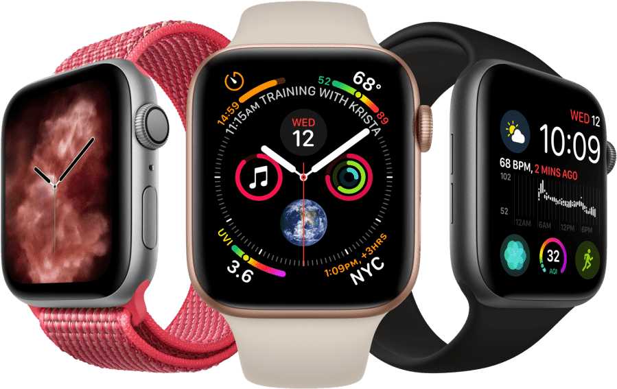
E-commerce card #
Use this card for your e-commerce websites and show information about the products and enable actions such as adding a review and adding the product to the cart.
<div class="w-full max-w-sm bg-neutral-primary-soft p-6 border border-default rounded-base shadow-xs">
    <a href="#">
        <img class="rounded-base mb-6" src="/docs/images/products/apple-watch.png" alt="product image" />
    </a>
    <div>
        <div class="flex items-center space-x-3 mb-6">
            <div class="flex items-center space-x-1 rtl:space-x-reverse">
                <svg class="w-5 h-5 text-fg-yellow" aria-hidden="true" xmlns="http://www.w3.org/2000/svg" width="24" height="24" fill="currentColor" viewBox="0 0 24 24"><path d="M13.849 4.22c-.684-1.626-3.014-1.626-3.698 0L8.397 8.387l-4.552.361c-1.775.14-2.495 2.331-1.142 3.477l3.468 2.937-1.06 4.392c-.413 1.713 1.472 3.067 2.992 2.149L12 19.35l3.897 2.354c1.52.918 3.405-.436 2.992-2.15l-1.06-4.39 3.468-2.938c1.353-1.146.633-3.336-1.142-3.477l-4.552-.36-1.754-4.17Z"/></svg>
                <svg class="w-5 h-5 text-fg-yellow" aria-hidden="true" xmlns="http://www.w3.org/2000/svg" width="24" height="24" fill="currentColor" viewBox="0 0 24 24"><path d="M13.849 4.22c-.684-1.626-3.014-1.626-3.698 0L8.397 8.387l-4.552.361c-1.775.14-2.495 2.331-1.142 3.477l3.468 2.937-1.06 4.392c-.413 1.713 1.472 3.067 2.992 2.149L12 19.35l3.897 2.354c1.52.918 3.405-.436 2.992-2.15l-1.06-4.39 3.468-2.938c1.353-1.146.633-3.336-1.142-3.477l-4.552-.36-1.754-4.17Z"/></svg>
                <svg class="w-5 h-5 text-fg-yellow" aria-hidden="true" xmlns="http://www.w3.org/2000/svg" width="24" height="24" fill="currentColor" viewBox="0 0 24 24"><path d="M13.849 4.22c-.684-1.626-3.014-1.626-3.698 0L8.397 8.387l-4.552.361c-1.775.14-2.495 2.331-1.142 3.477l3.468 2.937-1.06 4.392c-.413 1.713 1.472 3.067 2.992 2.149L12 19.35l3.897 2.354c1.52.918 3.405-.436 2.992-2.15l-1.06-4.39 3.468-2.938c1.353-1.146.633-3.336-1.142-3.477l-4.552-.36-1.754-4.17Z"/></svg>
                <svg class="w-5 h-5 text-fg-yellow" aria-hidden="true" xmlns="http://www.w3.org/2000/svg" width="24" height="24" fill="currentColor" viewBox="0 0 24 24"><path d="M13.849 4.22c-.684-1.626-3.014-1.626-3.698 0L8.397 8.387l-4.552.361c-1.775.14-2.495 2.331-1.142 3.477l3.468 2.937-1.06 4.392c-.413 1.713 1.472 3.067 2.992 2.149L12 19.35l3.897 2.354c1.52.918 3.405-.436 2.992-2.15l-1.06-4.39 3.468-2.938c1.353-1.146.633-3.336-1.142-3.477l-4.552-.36-1.754-4.17Z"/></svg>
                <svg class="w-5 h-5 text-fg-yellow" aria-hidden="true" xmlns="http://www.w3.org/2000/svg" width="24" height="24" fill="currentColor" viewBox="0 0 24 24"><path d="M13.849 4.22c-.684-1.626-3.014-1.626-3.698 0L8.397 8.387l-4.552.361c-1.775.14-2.495 2.331-1.142 3.477l3.468 2.937-1.06 4.392c-.413 1.713 1.472 3.067 2.992 2.149L12 19.35l3.897 2.354c1.52.918 3.405-.436 2.992-2.15l-1.06-4.39 3.468-2.938c1.353-1.146.633-3.336-1.142-3.477l-4.552-.36-1.754-4.17Z"/></svg>
            </div>
            <span class="bg-brand-softer border border-brand-subtle text-fg-brand-strong text-xs font-medium px-1.5 py-0.5 rounded-sm">4.8 out of 5</span>
        </div>
        <a href="#">
            <h5 class="text-xl text-heading font-semibold tracking-tight">Apple Watch Series 7 GPS, Aluminium Case, Starlight</h5>
        </a>
        <div class="flex items-center justify-between mt-6">
            <span class="text-3xl font-extrabold text-heading">$599</span>
            <button type="button" class="inline-flex items-center  text-white bg-brand hover:bg-brand-strong box-border border border-transparent focus:ring-4 focus:ring-brand-medium shadow-xs font-medium leading-5 rounded-base text-sm px-3 py-2 focus:outline-none">
                <svg class="w-4 h-4 me-1.5" aria-hidden="true" xmlns="http://www.w3.org/2000/svg" width="24" height="24" fill="none" viewBox="0 0 24 24"><path stroke="currentColor" stroke-linecap="round" stroke-linejoin="round" stroke-width="2" d="M5 4h1.5L9 16m0 0h8m-8 0a2 2 0 1 0 0 4 2 2 0 0 0 0-4Zm8 0a2 2 0 1 0 0 4 2 2 0 0 0 0-4Zm-8.5-3h9.25L19 7H7.312"/></svg>
                Add to cart
            </button>
        </div>
    </div>
</div>
Call to action card #
Use this CTA card example to encourage your users to visit a certain page such as downloading the iOS or Android application for your project.
Work fast from anywhere
Stay up to date and move work forward with Flowbite on iOS & Android.
Download the app today.
<div class="w-full text-center bg-neutral-primary-soft p-6 border border-default rounded-base shadow-xs">
    <h5 class="mb-3 text-2xl tracking-tight font-semibold text-heading">Work fast from anywhere</h5>
    <p class="mb-6 text-base text-body sm:text-lg">Stay up to date and move work forward with Flowbite on iOS & Android. <br>Download the app today.</p>
    <div class="items-center justify-center space-y-4 sm:flex sm:space-y-0 sm:space-x-4 rtl:space-x-reverse">
        <a href="#" class="w-full sm:w-auto bg-dark hover:bg-dark-strong focus:ring-4 focus:outline-none focus:ring-neutral-quaternary text-white rounded-base inline-flex items-center justify-center px-4 py-3">
            <svg class="me-2 w-7 h-7" aria-hidden="true" focusable="false" data-prefix="fab" data-icon="apple" role="img" xmlns="http://www.w3.org/2000/svg" viewBox="0 0 384 512"><path fill="currentColor" d="M318.7 268.7c-.2-36.7 16.4-64.4 50-84.8-18.8-26.9-47.2-41.7-84.7-44.6-35.5-2.8-74.3 20.7-88.5 20.7-15 0-49.4-19.7-76.4-19.7C63.3 141.2 4 184.8 4 273.5q0 39.3 14.4 81.2c12.8 36.7 59 126.7 107.2 125.2 25.2-.6 43-17.9 75.8-17.9 31.8 0 48.3 17.9 76.4 17.9 48.6-.7 90.4-82.5 102.6-119.3-65.2-30.7-61.7-90-61.7-91.9zm-56.6-164.2c27.3-32.4 24.8-61.9 24-72.5-24.1 1.4-52 16.4-67.9 34.9-17.5 19.8-27.8 44.3-25.6 71.9 26.1 2 49.9-11.4 69.5-34.3z"></path></svg>
            <div class="text-left rtl:text-right">
                <div class="text-xs">Download on the</div>
                <div class="text-sm font-bold">Mac App Store</div>
            </div>
        </a>
        <a href="#" class="w-full sm:w-auto bg-dark hover:bg-dark-strong focus:ring-4 focus:outline-none focus:ring-neutral-quaternary text-white rounded-base inline-flex items-center justify-center px-4 py-3">
            <svg class="me-2 w-7 h-7" aria-hidden="true" focusable="false" data-prefix="fab" data-icon="google-play" role="img" xmlns="http://www.w3.org/2000/svg" viewBox="0 0 512 512"><path fill="currentColor" d="M325.3 234.3L104.6 13l280.8 161.2-60.1 60.1zM47 0C34 6.8 25.3 19.2 25.3 35.3v441.3c0 16.1 8.7 28.5 21.7 35.3l256.6-256L47 0zm425.2 225.6l-58.9-34.1-65.7 64.5 65.7 64.5 60.1-34.1c18-14.3 18-46.5-1.2-60.8zM104.6 499l280.8-161.2-60.1-60.1L104.6 499z"></path></svg>
            <div class="text-left rtl:text-right">
                <div class="text-xs">Get in on</div>
                <div class="text-sm font-bold">Google Play</div>
            </div>
        </a>
    </div>
</div>
Card with nav tabs #
Use this example of a card component with navigation tabs that can change the content inside the card based on which one is currently active.
Powering innovation at 200,000+ companies worldwide
Empower Developers, IT Ops, and business teams to collaborate at high velocity. Respond to changes and deliver great customer and employee service experiences fast.
Learn moreWe invest in the world’s potential
- Dynamic reports and dashboards
- Templates for everyone
- Development workflow
- Limitless business automation
- 73M+
- Developers
- 100M+
- Public repositories
- 1000s
- Open source projects
<div class="w-full bg-neutral-primary border border-default rounded-base shadow-xs">
    <ul class="flex flex-wrap text-sm font-medium text-center text-body bg-neutral-secondary-soft border-b border-default rounded-t-base" id="defaultTab" data-tabs-toggle="#defaultTabContent" role="tablist">
        <li class="me-2">
            <button id="about-tab" data-tabs-target="#about" type="button" role="tab" aria-controls="about" aria-selected="true" class="inline-block p-4 text-fg-brand rounded-ss-base hover:bg-neutral-tertiary">About</button>
        </li>
        <li class="me-2">
            <button id="services-tab" data-tabs-target="#services" type="button" role="tab" aria-controls="services" aria-selected="false" class="inline-block p-4 hover:text-heading hover:bg-neutral-tertiary">Services</button>
        </li>
        <li class="me-2">
            <button id="statistics-tab" data-tabs-target="#statistics" type="button" role="tab" aria-controls="statistics" aria-selected="false" class="inline-block p-4 hover:text-heading hover:bg-neutral-tertiary">Facts</button>
        </li>
    </ul>
    <div id="defaultTabContent">
        <div class="hidden p-4 rounded-b-base md:p-8" id="about" role="tabpanel" aria-labelledby="about-tab">
            <h2 class="mb-2 text-2xl font-semibold tracking-tight text-heading">Powering innovation at <span class="font-extrabold">200,000+</span> companies worldwide</h2>
            <p class="mb-4 text-body">Empower Developers, IT Ops, and business teams to collaborate at high velocity. Respond to changes and deliver great customer and employee service experiences fast.</p>
            <a href="#" class="inline-flex items-center font-medium text-fg-brand hover:underline">
                Learn more
                <svg class="w-5 h-5 ms-1 rtl:rotate-180" aria-hidden="true" xmlns="http://www.w3.org/2000/svg" width="24" height="24" fill="none" viewBox="0 0 24 24"><path stroke="currentColor" stroke-linecap="round" stroke-linejoin="round" stroke-width="2" d="M19 12H5m14 0-4 4m4-4-4-4"/></svg>
            </a>
        </div>
        <div class="hidden p-4 rounded-b-base md:p-8" id="services" role="tabpanel" aria-labelledby="services-tab">
            <h2 class="mb-5 text-2xl font-semibold tracking-tight text-heading">We invest in the world’s potential</h2>
            <!-- List -->
            <ul role="list" class="space-y-4 text-body">
                <li class="flex space-x-1.5 rtl:space-x-reverse items-center">
                    <svg class="w-4 h-4 text-fg-brand shrink-0" aria-hidden="true" xmlns="http://www.w3.org/2000/svg" width="24" height="24" fill="none" viewBox="0 0 24 24"><path stroke="currentColor" stroke-linecap="round" stroke-linejoin="round" stroke-width="2" d="M8.5 11.5 11 14l4-4m6 2a9 9 0 1 1-18 0 9 9 0 0 1 18 0Z"/></svg>
                    <span class="leading-tight">Dynamic reports and dashboards</span>
                </li>
                <li class="flex space-x-2 rtl:space-x-reverse items-center">
                    <svg class="w-4 h-4 text-fg-brand shrink-0" aria-hidden="true" xmlns="http://www.w3.org/2000/svg" width="24" height="24" fill="none" viewBox="0 0 24 24"><path stroke="currentColor" stroke-linecap="round" stroke-linejoin="round" stroke-width="2" d="M8.5 11.5 11 14l4-4m6 2a9 9 0 1 1-18 0 9 9 0 0 1 18 0Z"/></svg>
                    <span class="leading-tight">Templates for everyone</span>
                </li>
                <li class="flex space-x-2 rtl:space-x-reverse items-center">
                    <svg class="w-4 h-4 text-fg-brand shrink-0" aria-hidden="true" xmlns="http://www.w3.org/2000/svg" width="24" height="24" fill="none" viewBox="0 0 24 24"><path stroke="currentColor" stroke-linecap="round" stroke-linejoin="round" stroke-width="2" d="M8.5 11.5 11 14l4-4m6 2a9 9 0 1 1-18 0 9 9 0 0 1 18 0Z"/></svg>
                    <span class="leading-tight">Development workflow</span>
                </li>
                <li class="flex space-x-2 rtl:space-x-reverse items-center">
                    <svg class="w-4 h-4 text-fg-brand shrink-0" aria-hidden="true" xmlns="http://www.w3.org/2000/svg" width="24" height="24" fill="none" viewBox="0 0 24 24"><path stroke="currentColor" stroke-linecap="round" stroke-linejoin="round" stroke-width="2" d="M8.5 11.5 11 14l4-4m6 2a9 9 0 1 1-18 0 9 9 0 0 1 18 0Z"/></svg>
                    <span class="leading-tight">Limitless business automation</span>
                </li>
            </ul>
        </div>
        <div class="hidden p-4 rrounded-b-base md:p-8" id="statistics" role="tabpanel" aria-labelledby="statistics-tab">
            <dl class="grid max-w-screen-xl grid-cols-2 gap-8 p-4 mx-auto text-heading sm:grid-cols-3 xl:grid-cols-6 sm:p-8">
                <div class="flex flex-col">
                    <dt class="mb-2 text-2xl font-semibold tracking-tight text-heading">73M+</dt>
                    <dd class="text-body">Developers</dd>
                </div>
                <div class="flex flex-col">
                    <dt class="mb-2 text-2xl font-semibold tracking-tight text-heading">100M+</dt>
                    <dd class="text-body">Public repositories</dd>
                </div>
                <div class="flex flex-col">
                    <dt class="mb-2 text-2xl font-semibold tracking-tight text-heading">1000s</dt>
                    <dd class="text-body">Open source projects</dd>
                </div>
            </dl>
        </div>
    </div>
</div>
Card full width tabs #
Use this example of a card component to show tabs that span the full width of the element and change the content area clicking on each one.
- 73M+
- Developers
- 100M+
- Public repositories
- 1000s
- Open source projects
We invest in the world’s potential
- Dynamic reports and dashboards
- Templates for everyone
- Development workflow
- Limitless business automation
Flowbite is an open-source library of interactive components built on top of Tailwind CSS including buttons, dropdowns, modals, navbars, and more.
Check out this guide to learn how to get started and start developing websites even faster with components on top of Tailwind CSS.
Flowbite is first conceptualized and designed using the Figma software so everything you see in the library has a design equivalent in our Figma file.
Check out the Figma design system based on the utility classes from Tailwind CSS and components from Flowbite.
The main difference is that the core components from Flowbite are open source under the MIT license, whereas Tailwind UI is a paid product. Another difference is that Flowbite relies on smaller and standalone components, whereas Tailwind UI offers sections of pages.
However, we actually recommend using both Flowbite, Flowbite Pro, and even Tailwind UI as there is no technical reason stopping you from using the best of two worlds.
Learn more about these technologies:
<div class="w-full bg-neutral-primary border border-default rounded-base shadow-xs">
    <div class="sm:hidden">
        <label for="tabs" class="sr-only">Select tab</label>
        <select id="tabs" class="bg-neutral-secondary-soft border-0 border-b border-default text-heading text-sm rounded-t-base focus:ring-brand block w-full p-2.5">
            <option>Statistics</option>
            <option>Services</option>
            <option>FAQ</option>
        </select>
    </div>
    <ul class="hidden text-sm font-medium text-center text-body divide-x divide-default rounded-base sm:flex rtl:divide-x-reverse" id="fullWidthTab" data-tabs-toggle="#fullWidthTabContent" role="tablist">
        <li class="w-full">
            <button id="stats-tab" data-tabs-target="#stats" type="button" role="tab" aria-controls="stats" aria-selected="true" class="inline-block w-full p-4 rounded-ss-base bg-neutral-secondary-soft hover:bg-neutral-tertiary focus:outline-none focus:bg-neutral-tertiary">Statistics</button>
        </li>
        <li class="w-full">
            <button id="about-tab" data-tabs-target="#about" type="button" role="tab" aria-controls="about" aria-selected="false" class="inline-block w-full p-4 bg-neutral-secondary-soft hover:bg-neutral-tertiary focus:outline-none focus:bg-neutral-tertiary">Services</button>
        </li>
        <li class="w-full">
            <button id="faq-tab" data-tabs-target="#faq" type="button" role="tab" aria-controls="faq" aria-selected="false" class="inline-block w-full p-4 rounded-se-base bg-neutral-secondary-soft hover:bg-neutral-tertiary focus:outline-none focus:bg-neutral-tertiary">FAQ</button>
        </li>
    </ul>
    <div id="fullWidthTabContent" class="border-t border-default">
        <div class="hidden p-4 rounded-base md:p-8" id="stats" role="tabpanel" aria-labelledby="stats-tab">
            <dl class="grid max-w-screen-xl grid-cols-2 gap-8 p-4 mx-auto text-heading sm:grid-cols-3 xl:grid-cols-6 sm:p-8">
                <div class="flex flex-col">
                    <dt class="mb-2 text-2xl font-semibold tracking-tight text-heading">73M+</dt>
                    <dd class="text-body">Developers</dd>
                </div>
                <div class="flex flex-col">
                    <dt class="mb-2 text-2xl font-semibold tracking-tight text-heading">100M+</dt>
                    <dd class="text-body">Public repositories</dd>
                </div>
                <div class="flex flex-col">
                    <dt class="mb-2 text-2xl font-semibold tracking-tight text-heading">1000s</dt>
                    <dd class="text-body">Open source projects</dd>
                </div>
            </dl>
        </div>
        <div class="hidden p-4 rounded-base md:p-8" id="about" role="tabpanel" aria-labelledby="about-tab">
            <h2 class="mb-5 text-2xl font-semibold tracking-tight text-heading">We invest in the world’s potential</h2>
            <!-- List -->
            <ul role="list" class="space-y-4 text-body">
                <li class="flex space-x-1.5 rtl:space-x-reverse items-center">
                    <svg class="w-4 h-4 text-fg-brand shrink-0" aria-hidden="true" xmlns="http://www.w3.org/2000/svg" width="24" height="24" fill="none" viewBox="0 0 24 24"><path stroke="currentColor" stroke-linecap="round" stroke-linejoin="round" stroke-width="2" d="M8.5 11.5 11 14l4-4m6 2a9 9 0 1 1-18 0 9 9 0 0 1 18 0Z"/></svg>
                    <span class="leading-tight">Dynamic reports and dashboards</span>
                </li>
                <li class="flex space-x-2 rtl:space-x-reverse items-center">
                    <svg class="w-4 h-4 text-fg-brand shrink-0" aria-hidden="true" xmlns="http://www.w3.org/2000/svg" width="24" height="24" fill="none" viewBox="0 0 24 24"><path stroke="currentColor" stroke-linecap="round" stroke-linejoin="round" stroke-width="2" d="M8.5 11.5 11 14l4-4m6 2a9 9 0 1 1-18 0 9 9 0 0 1 18 0Z"/></svg>
                    <span class="leading-tight">Templates for everyone</span>
                </li>
                <li class="flex space-x-2 rtl:space-x-reverse items-center">
                    <svg class="w-4 h-4 text-fg-brand shrink-0" aria-hidden="true" xmlns="http://www.w3.org/2000/svg" width="24" height="24" fill="none" viewBox="0 0 24 24"><path stroke="currentColor" stroke-linecap="round" stroke-linejoin="round" stroke-width="2" d="M8.5 11.5 11 14l4-4m6 2a9 9 0 1 1-18 0 9 9 0 0 1 18 0Z"/></svg>
                    <span class="leading-tight">Development workflow</span>
                </li>
                <li class="flex space-x-2 rtl:space-x-reverse items-center">
                    <svg class="w-4 h-4 text-fg-brand shrink-0" aria-hidden="true" xmlns="http://www.w3.org/2000/svg" width="24" height="24" fill="none" viewBox="0 0 24 24"><path stroke="currentColor" stroke-linecap="round" stroke-linejoin="round" stroke-width="2" d="M8.5 11.5 11 14l4-4m6 2a9 9 0 1 1-18 0 9 9 0 0 1 18 0Z"/></svg>
                    <span class="leading-tight">Limitless business automation</span>
                </li>
            </ul>
        </div>
        <div class="hidden p-4 rounded-base" id="faq" role="tabpanel" aria-labelledby="faq-tab">
            <div id="accordion-flush" data-accordion="collapse" data-active-classes="bg-neutral-primary text-heading" data-inactive-classes="text-body">
              <h2 id="accordion-flush-heading-1">
                <button type="button" class="flex items-center justify-between w-full py-5 font-medium rtl:text-right text-body border-b border-default gap-3" data-accordion-target="#accordion-flush-body-1" aria-expanded="true" aria-controls="accordion-flush-body-1">
                  <span>What is Flowbite?</span>
                  <svg data-accordion-icon class="w-5 h-5 rotate-180 shrink-0" aria-hidden="true" xmlns="http://www.w3.org/2000/svg" width="24" height="24" fill="none" viewBox="0 0 24 24"><path stroke="currentColor" stroke-linecap="round" stroke-linejoin="round" stroke-width="2" d="m5 15 7-7 7 7"/></svg>
                </button>
              </h2>
              <div id="accordion-flush-body-1" class="hidden" aria-labelledby="accordion-flush-heading-1">
                <div class="py-5 border-b border-default text-body">
                  <p class="mb-2">Flowbite is an open-source library of interactive components built on top of Tailwind CSS including buttons, dropdowns, modals, navbars, and more.</p>
                  <p>Check out this guide to learn how to <a href="/docs/getting-started/introduction/" class="text-fg-brand hover:underline">get started</a> and start developing websites even faster with components on top of Tailwind CSS.</p>
                </div>
              </div>
              <h2 id="accordion-flush-heading-2">
                <button type="button" class="flex items-center justify-between w-full py-5 font-medium rtl:text-right text-body border-b border-default gap-3" data-accordion-target="#accordion-flush-body-2" aria-expanded="false" aria-controls="accordion-flush-body-2">
                  <span>Is there a Figma file available?</span>
                  <svg data-accordion-icon class="w-5 h-5 rotate-180 shrink-0" aria-hidden="true" xmlns="http://www.w3.org/2000/svg" width="24" height="24" fill="none" viewBox="0 0 24 24"><path stroke="currentColor" stroke-linecap="round" stroke-linejoin="round" stroke-width="2" d="m5 15 7-7 7 7"/></svg>
                </button>
              </h2>
              <div id="accordion-flush-body-2" class="hidden" aria-labelledby="accordion-flush-heading-2">
                <div class="py-5 border-b border-default text-body">
                  <p class="mb-2">Flowbite is first conceptualized and designed using the Figma software so everything you see in the library has a design equivalent in our Figma file.</p>
                  <p>Check out the <a href="https://flowbite.com/figma/" class="text-fg-brand hover:underline">Figma design system</a> based on the utility classes from Tailwind CSS and components from Flowbite.</p>
                </div>
              </div>
              <h2 id="accordion-flush-heading-3">
                <button type="button" class="flex items-center justify-between w-full py-5 font-medium rtl:text-right text-body border-b border-default gap-3" data-accordion-target="#accordion-flush-body-3" aria-expanded="false" aria-controls="accordion-flush-body-3">
                  <span>What are the differences between Flowbite and Tailwind UI?</span>
                  <svg data-accordion-icon class="w-5 h-5 rotate-180 shrink-0" aria-hidden="true" xmlns="http://www.w3.org/2000/svg" width="24" height="24" fill="none" viewBox="0 0 24 24"><path stroke="currentColor" stroke-linecap="round" stroke-linejoin="round" stroke-width="2" d="m5 15 7-7 7 7"/></svg>
                </button>
              </h2>
              <div id="accordion-flush-body-3" class="hidden" aria-labelledby="accordion-flush-heading-3">
                <div class="py-5 text-body border-b border-default">
                  <p class="mb-2">The main difference is that the core components from Flowbite are open source under the MIT license, whereas Tailwind UI is a paid product. Another difference is that Flowbite relies on smaller and standalone components, whereas Tailwind UI offers sections of pages.</p>
                  <p class="mb-2">However, we actually recommend using both Flowbite, Flowbite Pro, and even Tailwind UI as there is no technical reason stopping you from using the best of two worlds.</p>
                  <p class="mb-2">Learn more about these technologies:</p>
                  <ul class="ps-5 list-disc">
                    <li><a href="https://flowbite.com/pro/" class="text-fg-brand hover:underline">Flowbite Pro</a></li>
                    <li><a href="https://tailwindui.com/" rel="nofollow" class="text-fg-brand hover:underline">Tailwind UI</a></li>
                  </ul>
                </div>
              </div>
            </div>
        </div>
    </div>
</div>
Card with list #
Use this card example if you want to show a list of data:
Latest Customers
View all-

Neil Sims
email@windster.com
$320 -
Bonnie Green
email@windster.com
$3467 -

Michael Gough
email@windster.com
$67 -

Lana Byrd
email@windster.com
$367 -

Thomas Lean
email@windster.com
$2367
<div class="w-full max-w-sm p-6 bg-neutral-primary-soft border border-default rounded-base shadow-xs">
    <div class="flex items-center justify-between mb-4">
        <h5 class="text-xl font-semibold leading-none text-heading">Latest Customers</h5>
        <a href="#" class="font-medium text-fg-brand hover:underline">View all</a>
   </div>
   <div class="flow-root">
        <ul role="list" class="divide-y divide-default">
            <li class="py-4 sm:py-4">
                <div class="flex items-center gap-2">
                    <div class="shrink-0">
                        <img class="w-8 h-8 rounded-full" src="/docs/images/people/profile-picture-1.jpg" alt="Neil image">
                    </div>
                    <div class="flex-1 min-w-0 ms-2">
                        <p class="font-medium text-heading truncate">
                            Neil Sims
                        </p>
                        <p class="text-sm text-body truncate">
                            email@windster.com
                        </p>
                    </div>
                    <div class="inline-flex items-center font-medium text-heading">
                        $320
                    </div>
                </div>
            </li>
            <li class="py-4 sm:py-4">
                <div class="flex items-center gap-2">
                    <div class="shrink-0">
                        <img class="w-8 h-8 rounded-full" src="/docs/images/people/profile-picture-3.jpg" alt="Bonnie image">
                    </div>
                    <div class="flex-1 min-w-0 ms-2">
                        <p class="font-medium text-heading truncate">
                            Bonnie Green
                        </p>
                        <p class="text-sm text-body truncate">
                            email@windster.com
                        </p>
                    </div>
                    <div class="inline-flex items-center font-medium text-heading">
                        $3467
                    </div>
                </div>
            </li>
            <li class="py-4 sm:py-4">
                <div class="flex items-center gap-2">
                    <div class="shrink-0">
                        <img class="w-8 h-8 rounded-full" src="/docs/images/people/profile-picture-2.jpg" alt="Michael image">
                    </div>
                    <div class="flex-1 min-w-0 ms-2">
                        <p class="font-medium text-heading truncate">
                            Michael Gough
                        </p>
                        <p class="text-sm text-body truncate">
                            email@windster.com
                        </p>
                    </div>
                    <div class="inline-flex items-center font-medium text-heading">
                        $67
                    </div>
                </div>
            </li>
            <li class="py-4 sm:py-4">
                <div class="flex items-center gap-2">
                    <div class="shrink-0">
                        <img class="w-8 h-8 rounded-full" src="/docs/images/people/profile-picture-4.jpg" alt="Lana image">
                    </div>
                    <div class="flex-1 min-w-0 ms-2">
                        <p class="font-medium text-heading truncate">
                            Lana Byrd
                        </p>
                        <p class="text-sm text-body truncate">
                            email@windster.com
                        </p>
                    </div>
                    <div class="inline-flex items-center font-medium text-heading">
                        $367
                    </div>
                </div>
            </li>
            <li class="pt-4 pb-0">
                <div class="flex items-center gap-2">
                    <div class="shrink-0">
                        <img class="w-8 h-8 rounded-full" src="/docs/images/people/profile-picture-5.jpg" alt="Thomas image">
                    </div>
                    <div class="flex-1 min-w-0 ms-2">
                        <p class="font-medium text-heading truncate">
                            Thomas Lean
                        </p>
                        <p class="text-sm text-body truncate">
                            email@windster.com
                        </p>
                    </div>
                    <div class="inline-flex items-center font-medium text-heading">
                        $2367
                    </div>
                </div>
            </li>
        </ul>
   </div>
</div>
Pricing card #
Show detailed information to potential customers about your product’s pricing plan, list of features, and a purchase button.
Standard plan
- 2 team members
- 20GB Cloud storage
- Integration help
- Sketch Files
- API Access
- Complete documentation
- 24×7 phone & email support
<div class="w-full max-w-sm p-6 bg-neutral-primary-soft border border-default rounded-base shadow-xs">
    <h5 class="mb-4 text-xl font-medium text-body">Standard plan</h5>
    <div class="flex items-baseline text-heading">
        <span class="text-5xl font-extrabold tracking-tight">$49</span>
        <span class="ms-2 font-medium text-body">/month</span>
    </div>
    <ul role="list" class="space-y-4 my-6">
        <li class="flex items-center">
            <svg class="w-5 h-5 shrink-0 text-fg-brand me-1.5" aria-hidden="true" xmlns="http://www.w3.org/2000/svg" width="24" height="24" fill="none" viewBox="0 0 24 24"><path stroke="currentColor" stroke-linecap="round" stroke-linejoin="round" stroke-width="2" d="M8.5 11.5 11 14l4-4m6 2a9 9 0 1 1-18 0 9 9 0 0 1 18 0Z"/></svg>
            <span class="text-body">2 team members</span>
        </li>
        <li class="flex items-center">
            <svg class="w-5 h-5 shrink-0 text-fg-brand me-1.5" aria-hidden="true" xmlns="http://www.w3.org/2000/svg" width="24" height="24" fill="none" viewBox="0 0 24 24"><path stroke="currentColor" stroke-linecap="round" stroke-linejoin="round" stroke-width="2" d="M8.5 11.5 11 14l4-4m6 2a9 9 0 1 1-18 0 9 9 0 0 1 18 0Z"/></svg>
            <span class="text-body">20GB Cloud storage</span>
        </li>
        <li class="flex items-center">
            <svg class="w-5 h-5 shrink-0 text-fg-brand me-1.5" aria-hidden="true" xmlns="http://www.w3.org/2000/svg" width="24" height="24" fill="none" viewBox="0 0 24 24"><path stroke="currentColor" stroke-linecap="round" stroke-linejoin="round" stroke-width="2" d="M8.5 11.5 11 14l4-4m6 2a9 9 0 1 1-18 0 9 9 0 0 1 18 0Z"/></svg>
            <span class="text-body">Integration help</span>
        </li>
        <li class="flex items-center line-through decoration-body">
            <svg class="w-5 h-5 shrink-0 text-fg-brand me-1.5" aria-hidden="true" xmlns="http://www.w3.org/2000/svg" width="24" height="24" fill="none" viewBox="0 0 24 24"><path stroke="currentColor" stroke-linecap="round" stroke-linejoin="round" stroke-width="2" d="M8.5 11.5 11 14l4-4m6 2a9 9 0 1 1-18 0 9 9 0 0 1 18 0Z"/></svg>
            <span class="text-body">Sketch Files</span>
        </li>
        <li class="flex items-center line-through decoration-body">
            <svg class="w-5 h-5 shrink-0 text-fg-brand me-1.5" aria-hidden="true" xmlns="http://www.w3.org/2000/svg" width="24" height="24" fill="none" viewBox="0 0 24 24"><path stroke="currentColor" stroke-linecap="round" stroke-linejoin="round" stroke-width="2" d="M8.5 11.5 11 14l4-4m6 2a9 9 0 1 1-18 0 9 9 0 0 1 18 0Z"/></svg>
            <span class="text-body">API Access</span>
        </li>
        <li class="flex items-center line-through decoration-body">
            <svg class="w-5 h-5 shrink-0 text-fg-brand me-1.5" aria-hidden="true" xmlns="http://www.w3.org/2000/svg" width="24" height="24" fill="none" viewBox="0 0 24 24"><path stroke="currentColor" stroke-linecap="round" stroke-linejoin="round" stroke-width="2" d="M8.5 11.5 11 14l4-4m6 2a9 9 0 1 1-18 0 9 9 0 0 1 18 0Z"/></svg>
            <span class="text-body">Complete documentation</span>
        </li>
        <li class="flex items-center line-through decoration-body">
            <svg class="w-5 h-5 shrink-0 text-fg-brand me-1.5" aria-hidden="true" xmlns="http://www.w3.org/2000/svg" width="24" height="24" fill="none" viewBox="0 0 24 24"><path stroke="currentColor" stroke-linecap="round" stroke-linejoin="round" stroke-width="2" d="M8.5 11.5 11 14l4-4m6 2a9 9 0 1 1-18 0 9 9 0 0 1 18 0Z"/></svg>
            <span class="text-body">24×7 phone & email support</span>
        </li>
    </ul>
    <button type="button" class="w-full text-white bg-brand hover:bg-brand-strong box-border border border-transparent focus:ring-4 focus:ring-brand-medium shadow-xs font-medium leading-5 rounded-base text-sm px-4 py-2.5 focus:outline-none">Choose plan</button>
</div>
Testimonial card #
Use this example to split cards into multiple sections such as for testimonials or reviews.
Very easy this was to integrate
If you care for your time, I hands down would go with this."

Solid foundation for any project
Designing with Figma components that can be easily translated to the utility classes of Tailwind CSS is a huge timesaver!"

Mindblowing workflow
Aesthetically, the well designed components are beautiful and will undoubtedly level up your app."

Efficient Collaborating
You have many examples that can be used to create a fast prototype for your team."

<div class="grid mb-8 bg-neutral-primary-soft border border-default rounded-base shadow-xs md:mb-12 md:grid-cols-2">
    <figure class="flex flex-col items-center justify-center p-8 text-center border-b border-default rounded-t-base md:rounded-t-none md:rounded-ss-base md:border-e">
        <blockquote class="max-w-2xl mx-auto mb-4 text-body lg:mb-8">
            <h3 class="text-lg font-semibold text-heading">Very easy this was to integrate</h3>
            <p class="my-4">If you care for your time, I hands down would go with this."</p>
        </blockquote>
        <figcaption class="flex items-center justify-center">
            <img class="rounded-full w-9 h-9" src="https://flowbite.s3.amazonaws.com/blocks/marketing-ui/avatars/karen-nelson.png" alt="profile picture">
            <div class="space-y-0.5 text-left rtl:text-right ms-2">
                <div class="leading-tight text-base text-heading font-medium mb-0.5">Bonnie Green</div>
                <div class="text-sm text-body">Developer at Open AI</div>
            </div>
        </figcaption>
    </figure>
    <figure class="flex flex-col items-center justify-center p-8 text-center border-b border-default md:rounded-se-base">
        <blockquote class="max-w-2xl mx-auto mb-4 text-body lg:mb-8">
            <h3 class="text-lg font-semibold text-heading">Solid foundation for any project</h3>
            <p class="my-4">Designing with Figma components that can be easily translated to the utility classes of Tailwind CSS is a huge timesaver!"</p>
        </blockquote>
        <figcaption class="flex items-center justify-center ">
            <img class="rounded-full w-9 h-9" src="https://flowbite.s3.amazonaws.com/blocks/marketing-ui/avatars/roberta-casas.png" alt="profile picture">
            <div class="space-y-0.5 text-left rtl:text-right ms-2">
                <div class="leading-tight text-base text-heading font-medium mb-0.5">Roberta Casas</div>
                <div class="text-sm text-body">Lead designer at Dropbox</div>
            </div>
        </figcaption>
    </figure>
    <figure class="flex flex-col items-center justify-center p-8 text-center border-b border-default md:rounded-es-base md:border-b-0 md:border-e">
        <blockquote class="max-w-2xl mx-auto mb-4 text-body lg:mb-8">
            <h3 class="text-lg font-semibold text-heading">Mindblowing workflow</h3>
            <p class="my-4">Aesthetically, the well designed components are beautiful and will undoubtedly level up your app."</p>
        </blockquote>
        <figcaption class="flex items-center justify-center ">
            <img class="rounded-full w-9 h-9" src="https://flowbite.s3.amazonaws.com/blocks/marketing-ui/avatars/jese-leos.png" alt="profile picture">
            <div class="space-y-0.5 text-left rtl:text-right ms-2">
                <div class="leading-tight text-base text-heading font-medium mb-0.5">Jese Leos</div>
                <div class="text-sm text-body">Software Engineer at Facebook</div>
            </div>
        </figcaption>
    </figure>
    <figure class="flex flex-col items-center justify-center p-8 text-center border-default rounded-b-base md:rounded-se-base">
        <blockquote class="max-w-2xl mx-auto mb-4 text-body lg:mb-8">
            <h3 class="text-lg font-semibold text-heading">Efficient Collaborating</h3>
            <p class="my-4">You have many examples that can be used to create a fast prototype for your team."</p>
        </blockquote>
        <figcaption class="flex items-center justify-center ">
            <img class="rounded-full w-9 h-9" src="https://flowbite.s3.amazonaws.com/blocks/marketing-ui/avatars/joseph-mcfall.png" alt="profile picture">
            <div class="space-y-0.5 text-left rtl:text-right ms-2">
                <div class="leading-tight text-base text-heading font-medium mb-0.5">Joseph McFall</div>
                <div class="text-sm text-body">CTO at Google<</div>
            </div>
        </figcaption>
    </figure>
</div>
Crypto card #
Use this web3 card component to show a list of applications that you can use to connect your crypto wallet for NFT related trading and authentication.
Connect wallet
Connect with one of our available wallet providers or create a new one.
<div class="w-full max-w-sm p-4 sm:p-6 bg-neutral-primary-soft border border-default rounded-base shadow-xs">
    <h5 class="mb-2 text-base md:text-xl font-semibold text-heading">Connect wallet</h5>
    <p class="text-body">Connect with one of our available wallet providers or create a new one.</p>
    <ul class="my-6 space-y-3">
        <li>
            <a href="#" class="flex items-center p-3 text-lg font-semibold text-heading rounded-base bg-neutral-secondary-medium hover:bg-neutral-tertiary-medium group">
                <svg aria-hidden="true" class="h-4" viewBox="0 0 40 38" fill="none" xmlns="http://www.w3.org/2000/svg"><path d="M39.0728 0L21.9092 12.6999L25.1009 5.21543L39.0728 0Z" fill="#E17726"/><path d="M0.966797 0.0151367L14.9013 5.21656L17.932 12.7992L0.966797 0.0151367Z" fill="#E27625"/><path d="M32.1656 27.0093L39.7516 27.1537L37.1004 36.1603L27.8438 33.6116L32.1656 27.0093Z" fill="#E27625"/><path d="M7.83409 27.0093L12.1399 33.6116L2.89876 36.1604L0.263672 27.1537L7.83409 27.0093Z" fill="#E27625"/><path d="M17.5203 10.8677L17.8304 20.8807L8.55371 20.4587L11.1924 16.4778L11.2258 16.4394L17.5203 10.8677Z" fill="#E27625"/><path d="M22.3831 10.7559L28.7737 16.4397L28.8067 16.4778L31.4455 20.4586L22.1709 20.8806L22.3831 10.7559Z" fill="#E27625"/><path d="M12.4115 27.0381L17.4768 30.9848L11.5928 33.8257L12.4115 27.0381Z" fill="#E27625"/><path d="M27.5893 27.0376L28.391 33.8258L22.5234 30.9847L27.5893 27.0376Z" fill="#E27625"/><path d="M22.6523 30.6128L28.6066 33.4959L23.0679 36.1282L23.1255 34.3884L22.6523 30.6128Z" fill="#D5BFB2"/><path d="M17.3458 30.6143L16.8913 34.3601L16.9286 36.1263L11.377 33.4961L17.3458 30.6143Z" fill="#D5BFB2"/><path d="M15.6263 22.1875L17.1822 25.4575L11.8848 23.9057L15.6263 22.1875Z" fill="#233447"/><path d="M24.3739 22.1875L28.133 23.9053L22.8184 25.4567L24.3739 22.1875Z" fill="#233447"/><path d="M12.8169 27.0049L11.9606 34.0423L7.37109 27.1587L12.8169 27.0049Z" fill="#CC6228"/><path d="M27.1836 27.0049L32.6296 27.1587L28.0228 34.0425L27.1836 27.0049Z" fill="#CC6228"/><path d="M31.5799 20.0605L27.6165 24.0998L24.5608 22.7034L23.0978 25.779L22.1387 20.4901L31.5799 20.0605Z" fill="#CC6228"/><path d="M8.41797 20.0605L17.8608 20.4902L16.9017 25.779L15.4384 22.7038L12.3988 24.0999L8.41797 20.0605Z" fill="#CC6228"/><path d="M8.15039 19.2314L12.6345 23.7816L12.7899 28.2736L8.15039 19.2314Z" fill="#E27525"/><path d="M31.8538 19.2236L27.2061 28.2819L27.381 23.7819L31.8538 19.2236Z" fill="#E27525"/><path d="M17.6412 19.5088L17.8217 20.6447L18.2676 23.4745L17.9809 32.166L16.6254 25.1841L16.625 25.1119L17.6412 19.5088Z" fill="#E27525"/><path d="M22.3562 19.4932L23.3751 25.1119L23.3747 25.1841L22.0158 32.1835L21.962 30.4328L21.75 23.4231L22.3562 19.4932Z" fill="#E27525"/><path d="M27.7797 23.6011L27.628 27.5039L22.8977 31.1894L21.9414 30.5138L23.0133 24.9926L27.7797 23.6011Z" fill="#F5841F"/><path d="M12.2373 23.6011L16.9873 24.9926L18.0591 30.5137L17.1029 31.1893L12.3723 27.5035L12.2373 23.6011Z" fill="#F5841F"/><path d="M10.4717 32.6338L16.5236 35.5013L16.4979 34.2768L17.0043 33.8323H22.994L23.5187 34.2753L23.48 35.4989L29.4935 32.641L26.5673 35.0591L23.0289 37.4894H16.9558L13.4197 35.0492L10.4717 32.6338Z" fill="#C0AC9D"/><path d="M22.2191 30.231L23.0748 30.8354L23.5763 34.8361L22.8506 34.2234H17.1513L16.4395 34.8485L16.9244 30.8357L17.7804 30.231H22.2191Z" fill="#161616"/><path d="M37.9395 0.351562L39.9998 6.53242L38.7131 12.7819L39.6293 13.4887L38.3895 14.4346L39.3213 15.1542L38.0875 16.2779L38.8449 16.8264L36.8347 19.1742L28.5894 16.7735L28.5179 16.7352L22.5762 11.723L37.9395 0.351562Z" fill="#763E1A"/><path d="M2.06031 0.351562L17.4237 11.723L11.4819 16.7352L11.4105 16.7735L3.16512 19.1742L1.15488 16.8264L1.91176 16.2783L0.678517 15.1542L1.60852 14.4354L0.350209 13.4868L1.30098 12.7795L0 6.53265L2.06031 0.351562Z" fill="#763E1A"/><path d="M28.1861 16.2485L36.9226 18.7921L39.7609 27.5398L32.2728 27.5398L27.1133 27.6049L30.8655 20.2912L28.1861 16.2485Z" fill="#F5841F"/><path d="M11.8139 16.2485L9.13399 20.2912L12.8867 27.6049L7.72971 27.5398H0.254883L3.07728 18.7922L11.8139 16.2485Z" fill="#F5841F"/><path d="M25.5283 5.17383L23.0847 11.7736L22.5661 20.6894L22.3677 23.4839L22.352 30.6225H17.6471L17.6318 23.4973L17.4327 20.6869L16.9139 11.7736L14.4707 5.17383H25.5283Z" fill="#F5841F"/></svg>
                <span class="flex-1 ms-3 whitespace-nowrap">MetaMask</span>
                <span class="bg-neutral-primary-soft border border-default-medium text-heading text-xs font-medium px-1.5 py-0.5 rounded-sm">Popular</span>
            </a>
        </li>
        <li>
            <a href="#" class="flex items-center p-3 text-lg font-semibold text-heading rounded-base bg-neutral-secondary-medium hover:bg-neutral-tertiary-medium group">
                <svg aria-hidden="true" class="h-5" viewBox="0 0 292 292" fill="none" xmlns="http://www.w3.org/2000/svg"><path d="M145.7 291.66C226.146 291.66 291.36 226.446 291.36 146C291.36 65.5541 226.146 0.339844 145.7 0.339844C65.2542 0.339844 0.0400391 65.5541 0.0400391 146C0.0400391 226.446 65.2542 291.66 145.7 291.66Z" fill="#3259A5"/><path d="M195.94 155.5C191.49 179.08 170.8 196.91 145.93 196.91C117.81 196.91 95.0204 174.12 95.0204 146C95.0204 117.88 117.81 95.0897 145.93 95.0897C170.8 95.0897 191.49 112.93 195.94 136.5H247.31C242.52 84.7197 198.96 44.1797 145.93 44.1797C89.6904 44.1797 44.1104 89.7697 44.1104 146C44.1104 202.24 89.7004 247.82 145.93 247.82C198.96 247.82 242.52 207.28 247.31 155.5H195.94Z" fill="white"/></svg>
                <span class="flex-1 ms-3 whitespace-nowrap">Coinbase Wallet</span>
            </a>
        </li>
        <li>
            <a href="#" class="flex items-center p-3 text-lg font-semibold text-heading rounded-base bg-neutral-secondary-medium hover:bg-neutral-tertiary-medium group">
                <svg aria-hidden="true" svg class="h-5"viewBox="0 0 75.591 75.591" xmlns="http://www.w3.org/2000/svg" xmlns:xlink="http://www.w3.org/1999/xlink"><linearGradient id="a" gradientTransform="matrix(0 -54.944 -54.944 0 23.62 79.474)" gradientUnits="userSpaceOnUse" x2="1"><stop offset="0" stop-color="#ff1b2d"/><stop offset=".3" stop-color="#ff1b2d"/><stop offset=".614" stop-color="#ff1b2d"/><stop offset="1" stop-color="#a70014"/></linearGradient><linearGradient id="b" gradientTransform="matrix(0 -48.595 -48.595 0 37.854 76.235)" gradientUnits="userSpaceOnUse" x2="1"><stop offset="0" stop-color="#9c0000"/><stop offset=".7" stop-color="#ff4b4b"/><stop offset="1" stop-color="#ff4b4b"/></linearGradient><g transform="matrix(1.3333 0 0 -1.3333 0 107.2)"><path d="m28.346 80.398c-15.655 0-28.346-12.691-28.346-28.346 0-15.202 11.968-27.609 26.996-28.313.44848-.02115.89766-.03314 1.3504-.03314 7.2574 0 13.876 2.7289 18.891 7.2137-3.3227-2.2036-7.2074-3.4715-11.359-3.4715-6.7504 0-12.796 3.3488-16.862 8.6297-3.1344 3.6999-5.1645 9.1691-5.3028 15.307v1.3349c.13821 6.1377 2.1683 11.608 5.302 15.307 4.0666 5.2809 10.112 8.6297 16.862 8.6297 4.1526 0 8.038-1.2679 11.361-3.4729-4.9904 4.4643-11.569 7.1876-18.786 7.2144-.03596 0-.07122.0014-.10718.0014z" fill="url(#a)"/><path d="m19.016 68.025c2.6013 3.0709 5.9607 4.9227 9.631 4.9227 8.2524 0 14.941-9.356 14.941-20.897s-6.6891-20.897-14.941-20.897c-3.6703 0-7.0297 1.851-9.6303 4.922 4.0659-5.2809 10.111-8.6297 16.862-8.6297 4.1519 0 8.0366 1.2679 11.359 3.4715 5.802 5.1906 9.4554 12.735 9.4554 21.133 0 8.397-3.6527 15.941-9.4533 21.131-3.3234 2.205-7.2088 3.4729-11.361 3.4729-6.7504 0-12.796-3.3488-16.862-8.6297" fill="url(#b)"/></g></svg>
                <span class="flex-1 ms-3 whitespace-nowrap">Opera Wallet</span>
            </a>
        </li>
        <li>
            <a href="#" class="flex items-center p-3 text-lg font-semibold text-heading rounded-base bg-neutral-secondary-medium hover:bg-neutral-tertiary-medium group">
                <svg aria-hidden="true" class="h-5" viewBox="0 0 512 512" version="1.1" xmlns="http://www.w3.org/2000/svg" xmlns:xlink="http://www.w3.org/1999/xlink"><defs><radialGradient cx="0%" cy="50%" fx="0%" fy="50%" r="100%" id="radialGradient-1"><stop stop-color="#5D9DF6" offset="0%"></stop><stop stop-color="#006FFF" offset="100%"></stop></radialGradient></defs><g id="Page-1" stroke="none" stroke-width="1" fill="none" fill-rule="evenodd"><g id="logo"><rect id="base" fill="url(#radialGradient-1)" x="0" y="0" width="512" height="512" rx="256"></rect><path d="M169.209772,184.531136 C217.142772,137.600733 294.857519,137.600733 342.790517,184.531136 L348.559331,190.179285 C350.955981,192.525805 350.955981,196.330266 348.559331,198.676787 L328.82537,217.99798 C327.627045,219.171241 325.684176,219.171241 324.485851,217.99798 L316.547278,210.225455 C283.10802,177.485633 228.89227,177.485633 195.453011,210.225455 L186.951456,218.549188 C185.75313,219.722448 183.810261,219.722448 182.611937,218.549188 L162.877976,199.227995 C160.481326,196.881474 160.481326,193.077013 162.877976,190.730493 L169.209772,184.531136 Z M383.602212,224.489406 L401.165475,241.685365 C403.562113,244.031874 403.562127,247.836312 401.165506,250.182837 L321.971538,327.721548 C319.574905,330.068086 315.689168,330.068112 313.292501,327.721609 C313.292491,327.721599 313.29248,327.721588 313.29247,327.721578 L257.08541,272.690097 C256.486248,272.103467 255.514813,272.103467 254.915651,272.690097 C254.915647,272.690101 254.915644,272.690105 254.91564,272.690108 L198.709777,327.721548 C196.313151,330.068092 192.427413,330.068131 190.030739,327.721634 C190.030725,327.72162 190.03071,327.721606 190.030695,327.721591 L110.834524,250.181849 C108.437875,247.835329 108.437875,244.030868 110.834524,241.684348 L128.397819,224.488418 C130.794468,222.141898 134.680206,222.141898 137.076856,224.488418 L193.284734,279.520668 C193.883897,280.107298 194.85533,280.107298 195.454493,279.520668 C195.454502,279.520659 195.45451,279.520651 195.454519,279.520644 L251.65958,224.488418 C254.056175,222.141844 257.941913,222.141756 260.338618,224.488222 C260.338651,224.488255 260.338684,224.488288 260.338717,224.488321 L316.546521,279.520644 C317.145683,280.107273 318.117118,280.107273 318.71628,279.520644 L374.923175,224.489406 C377.319825,222.142885 381.205562,222.142885 383.602212,224.489406 Z" id="WalletConnect" fill="#FFFFFF" fill-rule="nonzero"></path></g></g></svg>
                <span class="flex-1 ms-3 whitespace-nowrap">WalletConnect</span>
            </a>
        </li>
        <li>
            <a href="#" class="flex items-center p-3 text-lg font-semibold text-heading rounded-base bg-neutral-secondary-medium hover:bg-neutral-tertiary-medium group">
                <svg aria-hidden="true" class="h-4" viewBox="0 0 96 96" fill="none" xmlns="http://www.w3.org/2000/svg"><path d="M72.0998 0.600098H48.3998H24.5998H0.799805V24.4001V48.2001V49.7001V71.8001V71.9001V95.5001H24.5998V72.0001V71.9001V49.8001V48.3001V24.5001H48.3998H72.1998H95.9998V0.700104H72.0998V0.600098Z" fill="#617BFF"/><path d="M48.5 71.8002H72.1V95.6002H73C79.1 95.6002 84.9 93.2002 89.2 88.9002C93.5 84.6002 95.9 78.8002 95.9 72.7002V48.2002H48.5V71.8002Z" fill="#617BFF"/></svg>
                <span class="flex-1 ms-3 whitespace-nowrap">Fortmatic</span>
            </a>
        </li>
    </ul>
    <div>
    <a href="#" class="inline-flex items-center text-sm text-body hover:underline tracking-normal">
        <svg class="w-3.5 h-3.5 me-1.5" aria-hidden="true" xmlns="http://www.w3.org/2000/svg" width="24" height="24" fill="none" viewBox="0 0 24 24"><path stroke="currentColor" stroke-linecap="round" stroke-linejoin="round" stroke-width="2" d="M9.529 9.988a2.502 2.502 0 1 1 5 .191A2.441 2.441 0 0 1 12 12.582V14m-.01 3.008H12M21 12a9 9 0 1 1-18 0 9 9 0 0 1 18 0Z"/></svg>
        Why do I need to connect my wallet?
    </a>
    </div>
</div>