Tailwind CSS Gallery (Masonry) - Flowbite
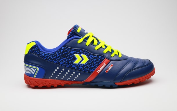
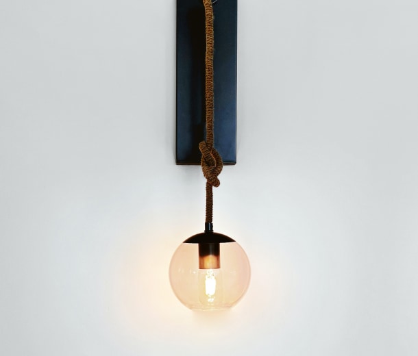
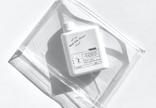
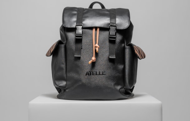
Use the image gallery component based on a masonry grid layout using flex and grid classes from Tailwind CSS to show multiple pictures based on various styles
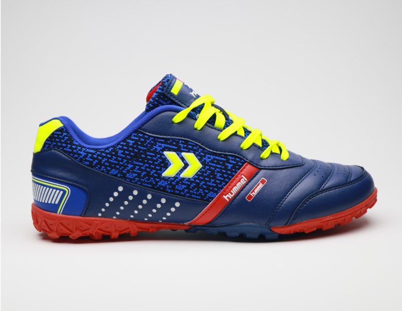
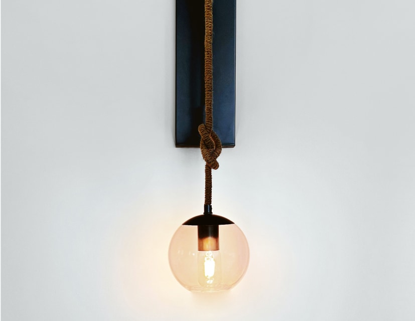
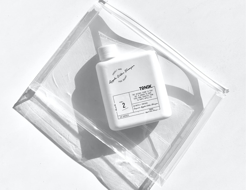
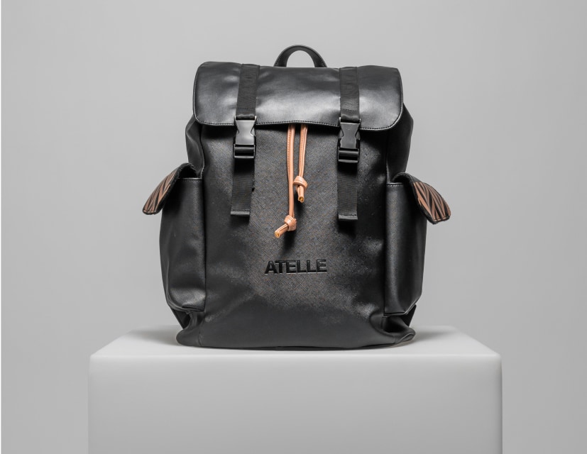
The gallery component can be used to show multiple images inside a masonry grid layout styles with the utility-first classes from Tailwind CSS to show a collection of pictures to your users based on various layouts, styles, sizes, and colors.
This component is recommended for usage within marketing UI interfaces and website sections when you want to show pictures of your team members, office pictures, or even case study images.
Default gallery #
Use this component to show a collection of images inside a gallery with three pictures on a row.


<div class="grid grid-cols-2 md:grid-cols-3 gap-4">
    <div>
        <img class="h-auto max-w-full rounded-base" src="https://flowbite.s3.amazonaws.com/docs/gallery/square/image.jpg" alt="">
    </div>
    <div>
        <img class="h-auto max-w-full rounded-base" src="https://flowbite.s3.amazonaws.com/docs/gallery/square/image-1.jpg" alt="">
    </div>
    <div>
        <img class="h-auto max-w-full rounded-base" src="https://flowbite.s3.amazonaws.com/docs/gallery/square/image-2.jpg" alt="">
    </div>
    <div>
        <img class="h-auto max-w-full rounded-base" src="https://flowbite.s3.amazonaws.com/docs/gallery/square/image-3.jpg" alt="">
    </div>
    <div>
        <img class="h-auto max-w-full rounded-base" src="https://flowbite.s3.amazonaws.com/docs/gallery/square/image-4.jpg" alt="">
    </div>
    <div>
        <img class="h-auto max-w-full rounded-base" src="https://flowbite.s3.amazonaws.com/docs/gallery/square/image-5.jpg" alt="">
    </div>
    <div>
        <img class="h-auto max-w-full rounded-base" src="https://flowbite.s3.amazonaws.com/docs/gallery/square/image-6.jpg" alt="">
    </div>
    <div>
        <img class="h-auto max-w-full rounded-base" src="https://flowbite.s3.amazonaws.com/docs/gallery/square/image-7.jpg" alt="">
    </div>
    <div>
        <img class="h-auto max-w-full rounded-base" src="https://flowbite.s3.amazonaws.com/docs/gallery/square/image-8.jpg" alt="">
    </div>
    <div>
        <img class="h-auto max-w-full rounded-base" src="https://flowbite.s3.amazonaws.com/docs/gallery/square/image-9.jpg" alt="">
    </div>
    <div>
        <img class="h-auto max-w-full rounded-base" src="https://flowbite.s3.amazonaws.com/docs/gallery/square/image-10.jpg" alt="">
    </div>
    <div>
        <img class="h-auto max-w-full rounded-base" src="https://flowbite.s3.amazonaws.com/docs/gallery/square/image-11.jpg" alt="">
    </div>
</div>
Masonry grid #
This example can be used to show the images inside a masonry grid layouts with four columns.


<div class="grid grid-cols-2 md:grid-cols-4 gap-4">
    <div class="grid gap-4">
        <div>
            <img class="h-auto max-w-full rounded-base" src="https://flowbite.s3.amazonaws.com/docs/gallery/masonry/image.jpg" alt="">
        </div>
        <div>
            <img class="h-auto max-w-full rounded-base" src="https://flowbite.s3.amazonaws.com/docs/gallery/masonry/image-1.jpg" alt="">
        </div>
        <div>
            <img class="h-auto max-w-full rounded-base" src="https://flowbite.s3.amazonaws.com/docs/gallery/masonry/image-2.jpg" alt="">
        </div>
    </div>
    <div class="grid gap-4">
        <div>
            <img class="h-auto max-w-full rounded-base" src="https://flowbite.s3.amazonaws.com/docs/gallery/masonry/image-3.jpg" alt="">
        </div>
        <div>
            <img class="h-auto max-w-full rounded-base" src="https://flowbite.s3.amazonaws.com/docs/gallery/masonry/image-4.jpg" alt="">
        </div>
        <div>
            <img class="h-auto max-w-full rounded-base" src="https://flowbite.s3.amazonaws.com/docs/gallery/masonry/image-5.jpg" alt="">
        </div>
    </div>
    <div class="grid gap-4">
        <div>
            <img class="h-auto max-w-full rounded-base" src="https://flowbite.s3.amazonaws.com/docs/gallery/masonry/image-6.jpg" alt="">
        </div>
        <div>
            <img class="h-auto max-w-full rounded-base" src="https://flowbite.s3.amazonaws.com/docs/gallery/masonry/image-7.jpg" alt="">
        </div>
        <div>
            <img class="h-auto max-w-full rounded-base" src="https://flowbite.s3.amazonaws.com/docs/gallery/masonry/image-8.jpg" alt="">
        </div>
    </div>
    <div class="grid gap-4">
        <div>
            <img class="h-auto max-w-full rounded-base" src="https://flowbite.s3.amazonaws.com/docs/gallery/masonry/image-9.jpg" alt="">
        </div>
        <div>
            <img class="h-auto max-w-full rounded-base" src="https://flowbite.s3.amazonaws.com/docs/gallery/masonry/image-10.jpg" alt="">
        </div>
        <div>
            <img class="h-auto max-w-full rounded-base" src="https://flowbite.s3.amazonaws.com/docs/gallery/masonry/image-11.jpg" alt="">
        </div>
    </div>
</div>
Featured image #
This example can be used to feature the most important image and show a row of five pictures below.
<div class="grid gap-4">
    <div>
        <img class="h-auto max-w-full rounded-base" src="https://flowbite.s3.amazonaws.com/docs/gallery/featured/image.jpg" alt="">
    </div>
    <div class="grid grid-cols-5 gap-4">
        <div>
            <img class="h-auto max-w-full rounded-base" src="https://flowbite.s3.amazonaws.com/docs/gallery/square/image-1.jpg" alt="">
        </div>
        <div>
            <img class="h-auto max-w-full rounded-base" src="https://flowbite.s3.amazonaws.com/docs/gallery/square/image-2.jpg" alt="">
        </div>
        <div>
            <img class="h-auto max-w-full rounded-base" src="https://flowbite.s3.amazonaws.com/docs/gallery/square/image-3.jpg" alt="">
        </div>
        <div>
            <img class="h-auto max-w-full rounded-base" src="https://flowbite.s3.amazonaws.com/docs/gallery/square/image-4.jpg" alt="">
        </div>
        <div>
            <img class="h-auto max-w-full rounded-base" src="https://flowbite.s3.amazonaws.com/docs/gallery/square/image-5.jpg" alt="">
        </div>
    </div>
</div>
Quad gallery #
Use this example to show four larger images with two items on a row.
<div class="grid grid-cols-2 gap-2">
        <div>
            <img class="h-auto max-w-full rounded-base" src="https://flowbite.s3.amazonaws.com/docs/gallery/square/image-1.jpg" alt="">
        </div>
        <div>
            <img class="h-auto max-w-full rounded-base" src="https://flowbite.s3.amazonaws.com/docs/gallery/square/image-2.jpg" alt="">
        </div>
        <div>
            <img class="h-auto max-w-full rounded-base" src="https://flowbite.s3.amazonaws.com/docs/gallery/square/image-3.jpg" alt="">
        </div>
        <div>
            <img class="h-auto max-w-full rounded-base" src="https://flowbite.s3.amazonaws.com/docs/gallery/square/image-4.jpg" alt="">
        </div>
    </div>
Gallery with slider #
This example uses the carousel slider functionality to show multiple images inside a slider gallery.
<div id="gallery" class="relative w-full" data-carousel="slide">
    <!-- Carousel wrapper -->
    <div class="relative h-56 overflow-hidden rounded-lg md:h-96">
         <!-- Item 1 -->
        <div class="hidden duration-700 ease-in-out" data-carousel-item>
            <img src="https://flowbite.s3.amazonaws.com/docs/gallery/square/image-1.jpg" class="absolute block max-w-full h-auto -translate-x-1/2 -translate-y-1/2 top-1/2 left-1/2" alt="">
        </div>
        <!-- Item 2 -->
        <div class="hidden duration-700 ease-in-out" data-carousel-item="active">
            <img src="https://flowbite.s3.amazonaws.com/docs/gallery/square/image-2.jpg" class="absolute block max-w-full h-auto -translate-x-1/2 -translate-y-1/2 top-1/2 left-1/2" alt="">
        </div>
        <!-- Item 3 -->
        <div class="hidden duration-700 ease-in-out" data-carousel-item>
            <img src="https://flowbite.s3.amazonaws.com/docs/gallery/square/image-3.jpg" class="absolute block max-w-full h-auto -translate-x-1/2 -translate-y-1/2 top-1/2 left-1/2" alt="">
        </div>
        <!-- Item 4 -->
        <div class="hidden duration-700 ease-in-out" data-carousel-item>
            <img src="https://flowbite.s3.amazonaws.com/docs/gallery/square/image-4.jpg" class="absolute block max-w-full h-auto -translate-x-1/2 -translate-y-1/2 top-1/2 left-1/2" alt="">
        </div>
        <!-- Item 5 -->
        <div class="hidden duration-700 ease-in-out" data-carousel-item>
            <img src="https://flowbite.s3.amazonaws.com/docs/gallery/square/image-5.jpg" class="absolute block max-w-full h-auto -translate-x-1/2 -translate-y-1/2 top-1/2 left-1/2" alt="">
        </div>
    </div>
    <!-- Slider controls -->
    <button type="button" class="absolute top-0 start-0 z-30 flex items-center justify-center h-full px-4 cursor-pointer group focus:outline-none" data-carousel-prev>
        <span class="inline-flex items-center justify-center w-10 h-10 rounded-full bg-white/30 dark:bg-gray-800/30 group-hover:bg-white/50 dark:group-hover:bg-gray-800/60 group-focus:ring-4 group-focus:ring-white dark:group-focus:ring-gray-800/70 group-focus:outline-none">
            <svg class="w-5 h-5 text-white rtl:rotate-180" aria-hidden="true" xmlns="http://www.w3.org/2000/svg" width="24" height="24" fill="none" viewBox="0 0 24 24"><path stroke="currentColor" stroke-linecap="round" stroke-linejoin="round" stroke-width="2" d="m15 19-7-7 7-7"/></svg>
            <span class="sr-only">Previous</span>
        </span>
    </button>
    <button type="button" class="absolute top-0 end-0 z-30 flex items-center justify-center h-full px-4 cursor-pointer group focus:outline-none" data-carousel-next>
        <span class="inline-flex items-center justify-center w-10 h-10 rounded-full bg-white/30 dark:bg-gray-800/30 group-hover:bg-white/50 dark:group-hover:bg-gray-800/60 group-focus:ring-4 group-focus:ring-white dark:group-focus:ring-gray-800/70 group-focus:outline-none">
            <svg class="w-5 h-5 text-white rtl:rotate-180" aria-hidden="true" xmlns="http://www.w3.org/2000/svg" width="24" height="24" fill="none" viewBox="0 0 24 24"><path stroke="currentColor" stroke-linecap="round" stroke-linejoin="round" stroke-width="2" d="m9 5 7 7-7 7"/></svg>
            <span class="sr-only">Next</span>
        </span>
    </button>
</div>
Custom slider controls #
This example uses an alternative style for the control button for the carousel slider component.
<div id="custom-controls-gallery" class="relative w-full" data-carousel="slide">
    <!-- Carousel wrapper -->
    <div class="relative h-56 overflow-hidden rounded-lg md:h-96">
         <!-- Item 1 -->
        <div class="hidden duration-700 ease-in-out" data-carousel-item>
            <img src="https://flowbite.s3.amazonaws.com/docs/gallery/square/image-1.jpg" class="absolute block max-w-full h-auto -translate-x-1/2 -translate-y-1/2 top-1/2 left-1/2" alt="">
        </div>
        <!-- Item 2 -->
        <div class="hidden duration-700 ease-in-out" data-carousel-item="active">
            <img src="https://flowbite.s3.amazonaws.com/docs/gallery/square/image-2.jpg" class="absolute block max-w-full h-auto -translate-x-1/2 -translate-y-1/2 top-1/2 left-1/2" alt="">
        </div>
        <!-- Item 3 -->
        <div class="hidden duration-700 ease-in-out" data-carousel-item>
            <img src="https://flowbite.s3.amazonaws.com/docs/gallery/square/image-3.jpg" class="absolute block max-w-full h-auto -translate-x-1/2 -translate-y-1/2 top-1/2 left-1/2" alt="">
        </div>
        <!-- Item 4 -->
        <div class="hidden duration-700 ease-in-out" data-carousel-item>
            <img src="https://flowbite.s3.amazonaws.com/docs/gallery/square/image-4.jpg" class="absolute block max-w-full h-auto -translate-x-1/2 -translate-y-1/2 top-1/2 left-1/2" alt="">
        </div>
        <!-- Item 5 -->
        <div class="hidden duration-700 ease-in-out" data-carousel-item>
            <img src="https://flowbite.s3.amazonaws.com/docs/gallery/square/image-5.jpg" class="absolute block max-w-full h-auto -translate-x-1/2 -translate-y-1/2 top-1/2 left-1/2" alt="">
        </div>
    </div>
    <div class="flex justify-center items-center pt-4">
        <button type="button" class="flex justify-center items-center me-4 h-full cursor-pointer group focus:outline-none" data-carousel-prev>
            <span class="text-body hover:text-heading group-focus:text-heading">
                <svg class="rtl:rotate-180 w-6 h-6" aria-hidden="true" xmlns="http://www.w3.org/2000/svg" width="24" height="24" fill="none" viewBox="0 0 24 24"><path stroke="currentColor" stroke-linecap="round" stroke-linejoin="round" stroke-width="2" d="M5 12h14M5 12l4-4m-4 4 4 4"/></svg>
                <span class="sr-only">Previous</span>
            </span>
        </button>
        <button type="button" class="flex justify-center items-center h-full cursor-pointer group focus:outline-none" data-carousel-next>
            <span class="text-body hover:text-heading group-focus:text-heading">
                <svg class="rtl:rotate-180 w-6 h-6" aria-hidden="true" xmlns="http://www.w3.org/2000/svg" width="24" height="24" fill="none" viewBox="0 0 24 24"><path stroke="currentColor" stroke-linecap="round" stroke-linejoin="round" stroke-width="2" d="M19 12H5m14 0-4 4m4-4-4-4"/></svg>
                <span class="sr-only">Next</span>
            </span>
        </button>
    </div>
</div>
Gallery with tag filters #
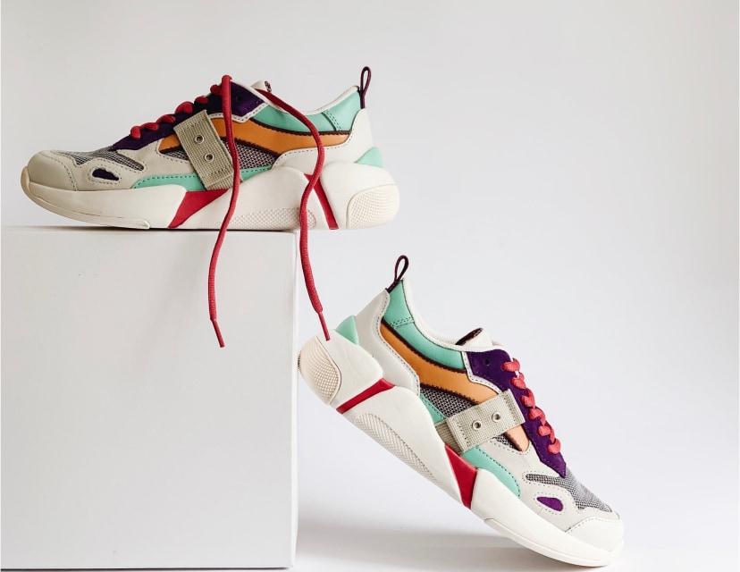
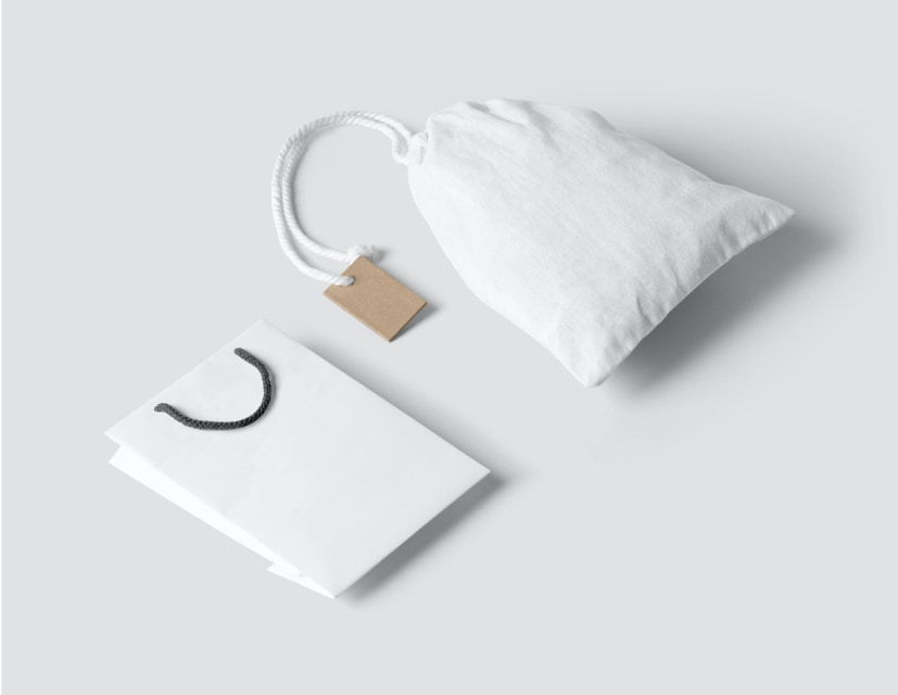
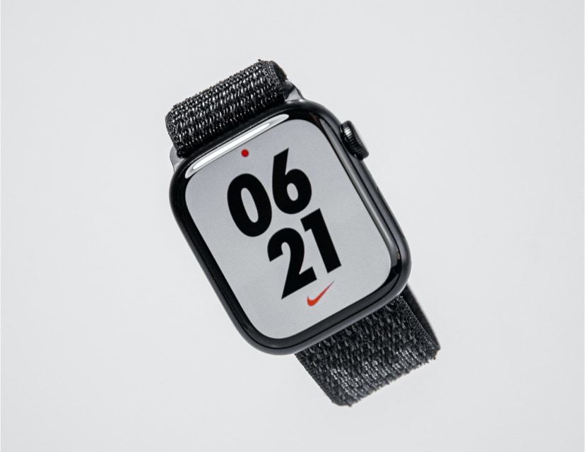
Use this example to show a list of tags and filter the images below based on the activately selected tag.
<div class="flex items-center justify-center py-4 md:py-8 flex-wrap">
<button type="button" class="text-fg-brand border border-brand bg-neutral-primary focus:ring-4 focus:outline-none focus:ring-neutral-tertiary rounded-base text-base font-medium px-5 py-2.5 text-center me-3 mb-3">All categories</button>
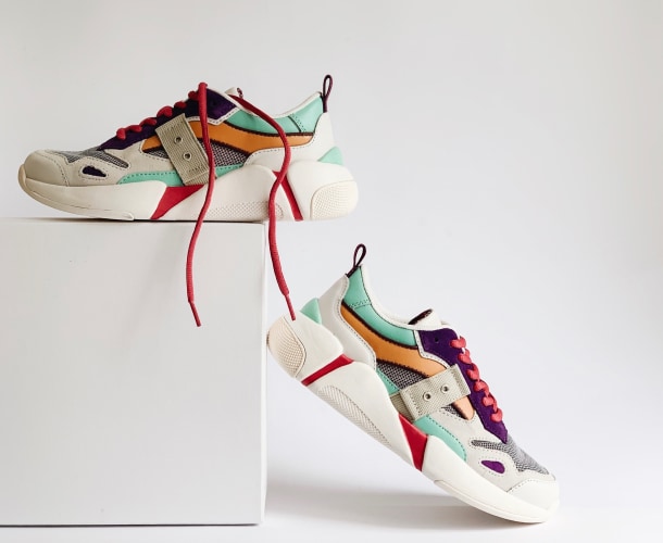
<button type="button" class="text-heading border border-buffer hover:border-default bg-neutral-primary focus:ring-4 focus:outline-none focus:ring-neutral-tertiary rounded-base text-base font-medium px-5 py-2.5 text-center me-3 mb-3">Shoes</button>
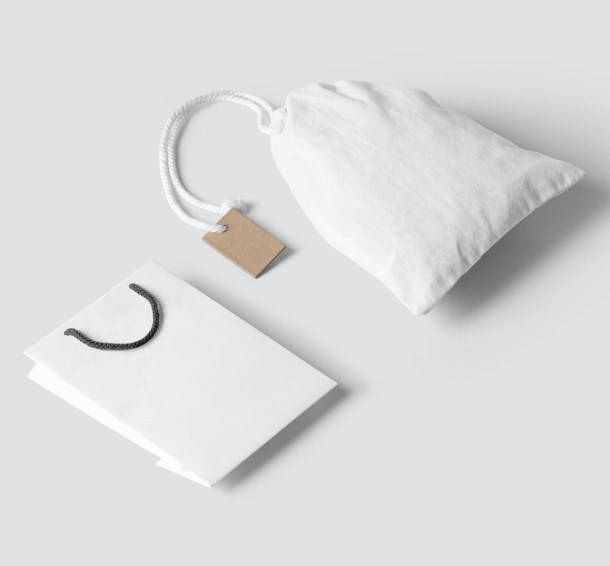
<button type="button" class="text-heading border border-buffer hover:border-default bg-neutral-primary focus:ring-4 focus:outline-none focus:ring-neutral-tertiary rounded-base text-base font-medium px-5 py-2.5 text-center me-3 mb-3">Bags</button>
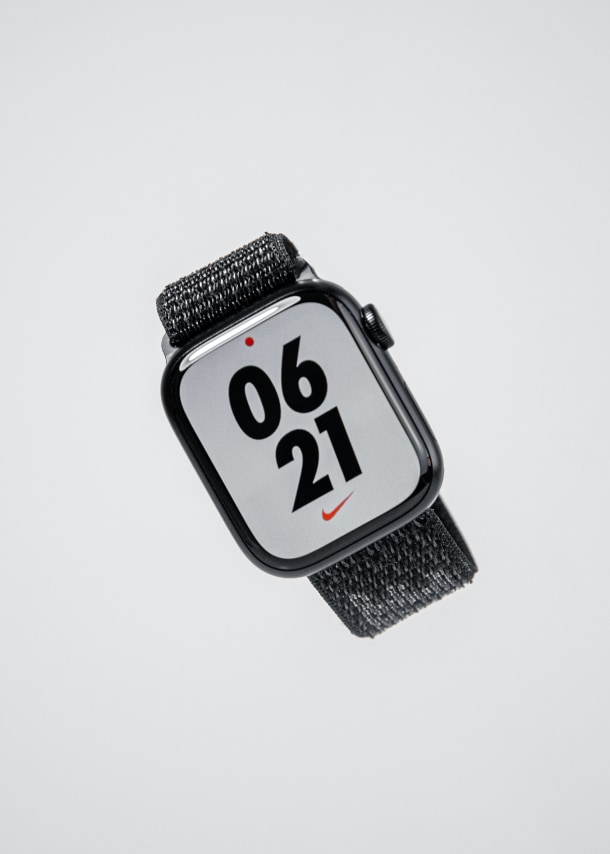
<button type="button" class="text-heading border border-buffer hover:border-default bg-neutral-primary focus:ring-4 focus:outline-none focus:ring-neutral-tertiary rounded-base text-base font-medium px-5 py-2.5 text-center me-3 mb-3">Electronics</button>
<button type="button" class="text-heading border border-buffer hover:border-default bg-neutral-primary focus:ring-4 focus:outline-none focus:ring-neutral-tertiary rounded-base text-base font-medium px-5 py-2.5 text-center me-3 mb-3">Gaming</button>
</div>
<div class="grid grid-cols-2 md:grid-cols-3 gap-4">
<div>
<img class="h-auto max-w-full rounded-base" src="https://flowbite.s3.amazonaws.com/docs/gallery/square/image.jpg" alt="">
</div>
<div>
<img class="h-auto max-w-full rounded-base" src="https://flowbite.s3.amazonaws.com/docs/gallery/square/image-1.jpg" alt="">
</div>
<div>
<img class="h-auto max-w-full rounded-base" src="https://flowbite.s3.amazonaws.com/docs/gallery/square/image-2.jpg" alt="">
</div>
<div>
<img class="h-auto max-w-full rounded-base" src="https://flowbite.s3.amazonaws.com/docs/gallery/square/image-3.jpg" alt="">
</div>
<div>
<img class="h-auto max-w-full rounded-base" src="https://flowbite.s3.amazonaws.com/docs/gallery/square/image-4.jpg" alt="">
</div>
<div>
<img class="h-auto max-w-full rounded-base" src="https://flowbite.s3.amazonaws.com/docs/gallery/square/image-5.jpg" alt="">
</div>
<div>
<img class="h-auto max-w-full rounded-base" src="https://flowbite.s3.amazonaws.com/docs/gallery/square/image-6.jpg" alt="">
</div>
<div>
<img class="h-auto max-w-full rounded-base" src="https://flowbite.s3.amazonaws.com/docs/gallery/square/image-7.jpg" alt="">
</div>
<div>
<img class="h-auto max-w-full rounded-base" src="https://flowbite.s3.amazonaws.com/docs/gallery/square/image-8.jpg" alt="">
</div>
<div>
<img class="h-auto max-w-full rounded-base" src="https://flowbite.s3.amazonaws.com/docs/gallery/square/image-9.jpg" alt="">
</div>
<div>
<img class="h-auto max-w-full rounded-base" src="https://flowbite.s3.amazonaws.com/docs/gallery/square/image-10.jpg" alt="">
</div>
<div>
<img class="h-auto max-w-full rounded-base" src="https://flowbite.s3.amazonaws.com/docs/gallery/square/image-11.jpg" alt="">
</div>
</div>