Tailwind CSS Popover - Flowbite
Use the popover component to show detailed information inside a pop-up box relative to the element that is being clicked or hovered based on multiple styles
Get started with the popover component to show any type of content inside a pop-up box when hovering or clicking over a trigger element. There are multiple examples that you can choose from, such as showing more information about a user profile, company profile, password strength, and more.
Make sure that you have the Flowbite JavaScript included in your project to enable the popover interactivity by following the quickstart guide.
Default popover #
Initialize a new popover by adding the data-popover-target="{elementId}" data attribute to the trigger element where elementId is the id of the popover component.
Popover title
And here's some amazing content. It's very engaging. Right?
<button data-popover-target="popover-default" type="button" class="text-white bg-brand box-border border border-transparent hover:bg-brand-strong focus:ring-4 focus:ring-brand-medium shadow-xs font-medium leading-5 rounded-base text-sm px-4 py-2.5 focus:outline-none">Default popover</button>

<div data-popover id="popover-default" role="tooltip" class="absolute z-10 invisible inline-block w-64 text-sm text-body transition-opacity duration-300 bg-neutral-primary-soft border border-default rounded-base shadow-xs opacity-0">
    <div class="px-3 py-2 bg-neutral-tertiary border-b border-default rounded-t-base">
        <h3 class="font-medium text-heading">Popover title</h3>
    </div>
    <div class="px-3 py-2">
        <p>And here's some amazing content. It's very engaging. Right?</p>
    </div>
    <div data-popper-arrow></div>
</div>
User profile #
Use this example to show more information about a user profile when hovering over the trigger component.

Open-source contributor & CEO. Building flowbite.com.
<button data-popover-target="popover-user-profile" type="button" class="text-white bg-brand box-border border border-transparent hover:bg-brand-strong focus:ring-4 focus:ring-brand-medium shadow-xs font-medium leading-5 rounded-base text-sm px-4 py-2.5 focus:outline-none">User profile</button>

<div data-popover id="popover-user-profile" role="tooltip" class="absolute z-10 invisible inline-block w-64 text-sm text-body transition-opacity duration-300 bg-neutral-primary-soft border border-default rounded-base shadow-xs opacity-0">
    <div class="p-3">
        <div class="flex items-center justify-between mb-2">
            <a href="#">
                <img class="w-8 h-8 rounded-full" src="/docs/images/people/profile-picture-1.jpg" alt="Jese Leos">
            </a>
            <div>
                <button type="button" class="text-white bg-brand hover:bg-brand-strong box-border border border-transparent focus:ring-4 focus:ring-brand-medium shadow-xs font-medium leading-5 rounded text-xs px-3 py-1.5 focus:outline-none">Follow</button>
            </div>
        </div>
        <p class="text-sm font-semibold text-heading">
            <a href="#">Jese Leos</a>
        </p>
        <p class="mb-3 text-sm font-normal text-body">
            <a href="#" class="hover:underline">@jeseleos</a>
        </p>
        <p class="mb-4 text-sm">Open-source contributor & CEO. Building <a href="#" class="text-fg-brand hover:underline">flowbite.com</a>.</p>
        <ul class="flex text-sm">
            <li class="me-2.5">
                <a href="#" class="hover:underline">
                    <span class="font-medium text-heading">799</span>
                    <span>Following</span>
                </a>
            </li>
            <li>
                <a href="#" class="hover:underline">
                    <span class="font-medium text-heading">3,758</span>
                    <span>Followers</span>
                </a>
            </li>
        </ul>
    </div>
    <div data-popper-arrow></div>
</div>
Company profile #
This example can be used to show more information about a company profile.
Tech company
Breaking news alerts and the most talked about stories.
- https://flowbite.com/
- 102,567,936 people like this including 5 of your friends


<button data-popover-target="popover-company-profile" type="button" class="text-white bg-brand box-border border border-transparent hover:bg-brand-strong focus:ring-4 focus:ring-brand-medium shadow-xs font-medium leading-5 rounded-base text-sm px-4 py-2.5 focus:outline-none">Company profile</button>

<div data-popover id="popover-company-profile" role="tooltip" class="absolute z-10 invisible inline-block w-80 text-sm text-body transition-opacity duration-300 bg-neutral-primary-soft border border-default rounded-base shadow-xs opacity-0">
    <div class="p-3">
        <div class="flex">
            <div class="me-3 shrink-0">
                <a href="#" class="block w-10 h-10 flex items-center justify-center p-2 bg-neutral-tertiary rounded">
                <img class="w-8 h-8 rounded-full" src="https://flowbite.com/docs/images/logo.svg" alt="Flowbite logo">
            </a>
            </div>
            <div>
                <p class="text-base font-semibold text-heading">
                    <a href="#" class="hover:underline">Flowbite</a>
                </p>
                <p class="mb-3 text-sm font-normal">
                    Tech company
                </p>
                <p class="mb-3 text-sm">Breaking news alerts and the most talked about stories.</p>
                <ul class="text-sm">
                    <li class="flex items-center mb-2">
                        <span class="me-2 font-semibold text-body">
                            <svg class="w-4 h-4" aria-hidden="true" xmlns="http://www.w3.org/2000/svg" width="24" height="24" fill="none" viewBox="0 0 24 24"><path stroke="currentColor" stroke-linecap="round" stroke-linejoin="round" stroke-width="2" d="M13.213 9.787a3.391 3.391 0 0 0-4.795 0l-3.425 3.426a3.39 3.39 0 0 0 4.795 4.794l.321-.304m-.321-4.49a3.39 3.39 0 0 0 4.795 0l3.424-3.426a3.39 3.39 0 0 0-4.794-4.795l-1.028.961"/></svg>
                        </span>
                        <a href="#" class="font-medium text-fg-brand hover:underline">https://flowbite.com/</a>
                    </li>
                    <li class="flex items-start mb-2">
                        <span class="me-2 text-body">
                            <svg class="w-4 h-4" aria-hidden="true" xmlns="http://www.w3.org/2000/svg" width="24" height="24" fill="none" viewBox="0 0 24 24"><path stroke="currentColor" stroke-linecap="round" stroke-linejoin="round" stroke-width="2" d="M12.01 6.001C6.5 1 1 8 5.782 13.001L12.011 20l6.23-7C23 8 17.5 1 12.01 6.002Z"/></svg>
                        </span>
                        <span class="-mt-1">102,567,936 people like this including 5 of your friends</span>
                    </li>
                </ul>
                <div class="flex mb-4 -space-x-3 rtl:space-x-reverse">
                    <img class="w-8 h-8 border-2 border-buffer-medium rounded-full" src="/docs/images/people/profile-picture-5.jpg" alt="">
                    <img class="w-8 h-8 border-2 border-buffer-medium rounded-full" src="/docs/images/people/profile-picture-2.jpg" alt="">
                    <img class="w-8 h-8 border-2 border-buffer-medium rounded-full" src="/docs/images/people/profile-picture-3.jpg" alt="">
                    <a class="flex items-center justify-center w-8 h-8 text-xs font-medium text-heading bg-neutral-tertiary border-2 border-buffer-medium rounded-full hover:bg-neutral-quaternary" href="#">+3</a>
                </div>
                <div class="flex space-x-2">
                    <button type="button" class="flex items-center justify-center w-full text-body bg-neutral-primary-medium border border-default-medium hover:bg-neutral-secondary-strong hover:text-heading hover:border-default-strong focus:ring-4 focus:ring-neutral-tertiary-soft shadow-xs font-medium leading-5 rounded-base text-sm px-3 py-2 focus:outline-none">
                        <svg class="w-4 h-4 me-1.5 -ms-0.5" aria-hidden="true" xmlns="http://www.w3.org/2000/svg" width="24" height="24" fill="none" viewBox="0 0 24 24"><path stroke="currentColor" stroke-linecap="round" stroke-linejoin="round" stroke-width="2" d="M7 11c.889-.086 1.416-.543 2.156-1.057a22.323 22.323 0 0 0 3.958-5.084 1.6 1.6 0 0 1 .582-.628 1.549 1.549 0 0 1 1.466-.087c.205.095.388.233.537.406a1.64 1.64 0 0 1 .384 1.279l-1.388 4.114M7 11H4v6.5A1.5 1.5 0 0 0 5.5 19v0A1.5 1.5 0 0 0 7 17.5V11Zm6.5-1h4.915c.286 0 .372.014.626.15.254.135.472.332.637.572a1.874 1.874 0 0 1 .215 1.673l-2.098 6.4C17.538 19.52 17.368 20 16.12 20c-2.303 0-4.79-.943-6.67-1.475"/></svg>
                        Like page
                    </button>
                    <button id="dropdown-button" data-dropdown-toggle="dropdown-menu" data-dropdown-placement="right" type="button" class="flex items-center justify-center text-body bg-neutral-primary-medium border border-default-medium hover:bg-neutral-secondary-strong hover:text-heading hover:border-default-strong focus:ring-4 focus:ring-neutral-tertiary-soft shadow-xs font-medium leading-5 rounded-base w-9 h-9 shrink-0 focus:outline-none">
                        <svg class="w-4 h-4" aria-hidden="true" xmlns="http://www.w3.org/2000/svg" width="24" height="24" fill="none" viewBox="0 0 24 24"><path stroke="currentColor" stroke-linecap="round" stroke-width="3" d="M6 12h.01m6 0h.01m5.99 0h.01"/></svg>
                    </button>
                </div>
                <div id="dropdown-menu" class="z-10 hidden bg-neutral-primary-medium border border-default-medium rounded-base shadow-lg w-44">
                    <ul class="p-2 text-sm text-body font-medium" aria-labelledby="dropdown-button">
                        <li>
                            <a href="#" class="inline-flex items-center w-full p-2 hover:bg-neutral-tertiary-medium hover:text-heading rounded">Report this page</a>
                        </li>
                        <li>
                            <a href="#" class="inline-flex items-center w-full p-2 hover:bg-neutral-tertiary-medium hover:text-heading rounded">Add to favorites</a>
                        </li>
                        <li>
                            <a href="#" class="inline-flex items-center w-full p-2 hover:bg-neutral-tertiary-medium hover:text-heading rounded">Block this page</a>
                        </li>
                        <li>
                            <a href="#" class="inline-flex items-center w-full p-2 hover:bg-neutral-tertiary-medium hover:text-heading rounded">Invite users</a>
                        </li>
                    </ul>
                </div>
            </div>
        </div>
    </div>
    <div data-popper-arrow></div>
</div>
Image popover #
Use this example to trigger a popover component with detailed information and an image when hovering over a portion of highlighted text inspired by Wikipedia and other large news outlets.
Due to its central geographic location in Southern Europe, Italy has historically been home to myriad peoples and cultures. In addition to the various ancient peoples dispersed throughout what is now modern-day Italy, the most predominant being the Indo-European Italic peoples who gave the peninsula its name, beginning from the classical era, Phoenicians and Carthaginians founded colonies mostly in insular Italy
About Italy
Italy is located in the middle of the Mediterranean Sea, in Southern Europe it is also part of Western Europe.
A unitary parliamentary republic with Rome as its capital and largest city.
Read more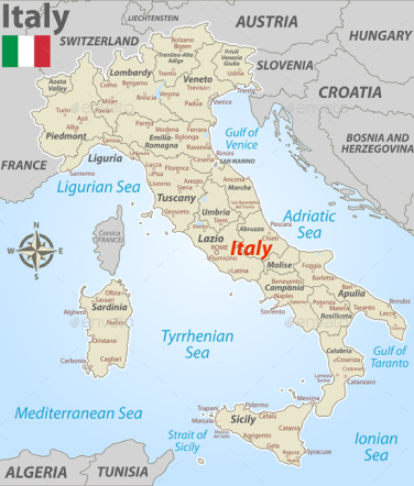
<p class="text-body">Due to its central geographic location in Southern Europe, <a href="#" class="text-fg-brand font-medium underline hover:no-underline" data-popover-target="popover-image">Italy</a> has historically been home to myriad peoples and cultures. In addition to the various ancient peoples dispersed throughout what is now modern-day Italy, the most predominant being the Indo-European Italic peoples who gave the peninsula its name, beginning from the classical era, Phoenicians and Carthaginians founded colonies mostly in insular Italy</p>
<div data-popover id="popover-image" role="tooltip" class="absolute z-10 p-3 invisible inline-block text-sm text-body transition-opacity duration-300 bg-neutral-primary-soft border border-default rounded-lg shadow-xs opacity-0 w-96">
    <div class="grid grid-cols-5">
        <div class="col-span-3 pe-3">
            <div class="space-y-2">
                <h3 class="font-semibold text-heading">About Italy</h3>
                <p class="mb-2">Italy is located in the middle of the Mediterranean Sea, in Southern Europe it is also part of Western Europe.</p>
                <p>A unitary parliamentary republic with Rome as its capital and largest city.</p>
                <a href="#" class="flex items-center font-medium text-fg-brand hover:underline">
                    Read more
                    <svg class="w-4 h-4 ms-1 rtl:rotate-180" aria-hidden="true" xmlns="http://www.w3.org/2000/svg" width="24" height="24" fill="none" viewBox="0 0 24 24"><path stroke="currentColor" stroke-linecap="round" stroke-linejoin="round" stroke-width="2" d="M19 12H5m14 0-4 4m4-4-4-4"/></svg>
                </a>
            </div>
        </div>
        <img src="/docs/images/popovers/italy.png" class="h-full col-span-2 rounded" alt="Italy map" />
    </div>
    <div data-popper-arrow></div>
</div>
Description popover #
Show helpful information inside a popover when hovering over a question mark button.
This is just some informational text
Activity growth - Incremental
Report helps navigate cumulative growth of community activities. Ideally, the chart should have a growing trend, as stagnating chart signifies a significant decrease of community activity.
Calculation
For each date bucket, the all-time volume of activities is calculated. This means that activities in period n contain all activities up to period n, plus the activities generated by your community in period.
Read more<p class="flex items-center text-sm text-body">This is just some informational text <button data-popover-target="popover-description" data-popover-placement="bottom-end" type="button"><svg class="w-4 h-4 text-body hover:text-heading ms-2" aria-hidden="true" xmlns="http://www.w3.org/2000/svg" width="24" height="24" fill="none" viewBox="0 0 24 24"><path stroke="currentColor" stroke-linecap="round" stroke-linejoin="round" stroke-width="2" d="M9.529 9.988a2.502 2.502 0 1 1 5 .191A2.441 2.441 0 0 1 12 12.582V14m-.01 3.008H12M21 12a9 9 0 1 1-18 0 9 9 0 0 1 18 0Z"/></svg><span class="sr-only">Show information</span></button></p>
<div data-popover id="popover-description" role="tooltip" class="absolute z-10 p-3 invisible inline-block text-sm text-body transition-opacity duration-300 bg-neutral-primary-soft border border-default rounded-base shadow-xs opacity-0 w-72">
<div>
<h3 class="font-semibold text-heading mb-2">Activity growth - Incremental</h3>
<p class="mb-4">Report helps navigate cumulative growth of community activities. Ideally, the chart should have a growing trend, as stagnating chart signifies a significant decrease of community activity.</p>
<h3 class="font-semibold text-heading mb-2">Calculation</h3>
<p class="mb-4">For each date bucket, the all-time volume of activities is calculated. This means that activities in period n contain all activities up to period n, plus the activities generated by your community in period.</p>
<a href="#" class="flex items-center font-medium text-fg-brand hover:underline">
Read more
<svg class="w-4 h-4 ms-1 rtl:rotate-180" aria-hidden="true" xmlns="http://www.w3.org/2000/svg" width="24" height="24" fill="none" viewBox="0 0 24 24"><path stroke="currentColor" stroke-linecap="round" stroke-linejoin="round" stroke-width="2" d="M19 12H5m14 0-4 4m4-4-4-4"/></svg>
</a>
</div>
<div data-popper-arrow></div>
</div>
Progress popover #
Show a progress bar with details inside a popover when hovering over a settings button.
Available storage
This server has 30 of 150 GB of block storage remaining.
<button data-popover-target="popover-description" type="button" class="inline-flex items-center  text-white bg-brand hover:bg-brand-strong box-border border border-transparent focus:ring-4 focus:ring-brand-medium shadow-xs font-medium leading-5 rounded-base text-sm px-4 py-2.5 focus:outline-none">
    <svg class="w-4 h-4 me-1.5 -ms-0.5" aria-hidden="true" xmlns="http://www.w3.org/2000/svg" width="24" height="24" fill="none" viewBox="0 0 24 24"><path stroke="currentColor" stroke-linecap="round" stroke-linejoin="round" stroke-width="2" d="M19 6c0 1.657-3.134 3-7 3S5 7.657 5 6m14 0c0-1.657-3.134-3-7-3S5 4.343 5 6m14 0v6M5 6v6m0 0c0 1.657 3.134 3 7 3s7-1.343 7-3M5 12v6c0 1.657 3.134 3 7 3s7-1.343 7-3v-6"/></svg>
    Storage status
</button>

<div data-popover id="popover-description" role="tooltip" class="absolute z-10 p-3 invisible inline-block w-64 text-sm text-body transition-opacity duration-300 bg-neutral-primary-soft border border-default rounded-base shadow-xs opacity-0">
    <div class="space-y-2.5">
        <h3 class="font-semibold text-heading">Available storage</h3>
        <p>This server has <span class="font-semibold text-heading">30</span> of <span class="font-semibold text-heading">150 GB</span> of block storage remaining.</p>
        <div class="w-full bg-neutral-quaternary rounded-full h-1.5 mb-4">
            <div class="bg-danger h-1.5 rounded-full" style="width: 85%"></div>
        </div>
    </div>
    <a href="#" class="flex items-center font-medium text-fg-brand hover:underline">
        Upgrade now
        <svg class="w-4 h-4 ms-1 rtl:rotate-180" aria-hidden="true" xmlns="http://www.w3.org/2000/svg" width="24" height="24" fill="none" viewBox="0 0 24 24"><path stroke="currentColor" stroke-linecap="round" stroke-linejoin="round" stroke-width="2" d="M19 12H5m14 0-4 4m4-4-4-4"/></svg>
    </a>
    <div data-popper-arrow></div>
</div>
Password strength #
Dynamically show the password strength progress when creating a new password positioned relative to the input element.
<form>
    <div class="mb-6">
        <label for="email" class="block mb-2.5 text-sm font-medium text-heading">Your email</label>
        <input type="email" id="email" class="bg-neutral-secondary-medium border border-default-medium text-heading text-sm rounded-base focus:ring-brand focus:border-brand block w-full px-3 py-2.5 shadow-xs placeholder:text-body" placeholder="name@flowbite.com" required />
    </div>
    <div class="mb-6">
        <label for="password" class="block mb-2.5 text-sm font-medium text-heading">Your password</label>
        <input data-popover-target="popover-password" data-popover-placement="bottom" type="password" id="password" class="bg-neutral-secondary-medium border border-default-medium text-heading text-sm rounded-base focus:ring-brand focus:border-brand block w-full px-3 py-2.5 shadow-xs placeholder:text-body" required />
        <div data-popover id="popover-password" role="tooltip" class="absolute z-10 p-3 invisible inline-block w-72 text-sm text-body transition-opacity duration-300 bg-neutral-primary-soft border border-default rounded-base shadow-xs opacity-0">
            <div>
                <h3 class="font-semibold text-heading mb-3">Must have at least 6 characters</h3>
                <div class="grid grid-cols-4 gap-2 mb-3">
                    <div class="h-1 bg-warning rounded-full"></div>
                    <div class="h-1 bg-warning rounded-full"></div>
                    <div class="h-1 bg-neutral-quaternary rounded-full"></div>
                    <div class="h-1 bg-neutral-quaternary rounded-full"></div>
                </div>
                <p class="mb-2">It’s better to have:</p>
                <ul>
                    <li class="flex items-center mb-1">
                        <svg class="w-4 h-4 me-1.5 text-success" aria-hidden="true" xmlns="http://www.w3.org/2000/svg" width="24" height="24" fill="none" viewBox="0 0 24 24"><path stroke="currentColor" stroke-linecap="round" stroke-linejoin="round" stroke-width="2" d="M5 11.917 9.724 16.5 19 7.5"/></svg>
                        Upper & lower case letters
                    </li>
                    <li class="flex items-center mb-1">
                        <svg class="w-4 h-4 me-1.5" aria-hidden="true" xmlns="http://www.w3.org/2000/svg" width="24" height="24" fill="none" viewBox="0 0 24 24"><path stroke="currentColor" stroke-linecap="round" stroke-linejoin="round" stroke-width="2" d="M6 18 17.94 6M18 18 6.06 6"/></svg>
                        A symbol (#$&)
                    </li>
                    <li class="flex items-center">
                        <svg class="w-4 h-4 me-1.5" aria-hidden="true" xmlns="http://www.w3.org/2000/svg" width="24" height="24" fill="none" viewBox="0 0 24 24"><path stroke="currentColor" stroke-linecap="round" stroke-linejoin="round" stroke-width="2" d="M6 18 17.94 6M18 18 6.06 6"/></svg>
                        A longer password (min. 12 chars.)
                    </li>
                </ul>
            </div>
            <div data-popper-arrow></div>
        </div>
    </div>
    <div class="flex items-start mb-6">
        <div class="flex items-center h-5">
        <input id="remember" type="checkbox" value="" class="w-4 h-4 border border-default-strong rounded-xs bg-neutral-secondary-strong focus:ring-2 focus:ring-brand-soft" required />
        </div>
        <label for="remember" class="ms-2 text-sm font-medium text-heading">I agree with the <a href="#" class="text-fg-brand hover:underline">terms and conditions</a>.</label>
    </div>
    <button type="submit" class="text-white bg-brand box-border border border-transparent hover:bg-brand-strong focus:ring-4 focus:ring-brand-medium shadow-xs font-medium leading-5 rounded-base text-sm px-4 py-2.5 focus:outline-none">Submit</button>
</form>
Placement #
Set the position of the popover component relative to the trigger element by using the data-popover-placement="{top|right|bottom|left}" data attribute and its values.
Popover top
And here's some amazing content. It's very engaging. Right?
Popover right
And here's some amazing content. It's very engaging. Right?
Popover bottom
And here's some amazing content. It's very engaging. Right?
Popover left
And here's some amazing content. It's very engaging. Right?
<button data-popover-target="popover-top" data-popover-placement="top" type="button" class="text-white bg-brand box-border border border-transparent hover:bg-brand-strong focus:ring-4 focus:ring-brand-medium shadow-xs font-medium leading-5 rounded-base text-sm px-4 py-2.5 focus:outline-none">Top popover</button>

<div data-popover id="popover-top" role="tooltip" class="absolute z-10 invisible inline-block w-64 text-sm text-body transition-opacity duration-300 bg-neutral-primary-soft border border-default rounded-base shadow-xs opacity-0">
    <div class="px-3 py-2 bg-neutral-tertiary border-b border-default rounded-t-base">
        <h3 class="font-medium text-heading">Popover top</h3>
    </div>
    <div class="px-3 py-2">
        <p>And here's some amazing content. It's very engaging. Right?</p>
    </div>
    <div data-popper-arrow></div>
</div>
<button data-popover-target="popover-right" data-popover-placement="right" type="button" class="text-white bg-brand box-border border border-transparent hover:bg-brand-strong focus:ring-4 focus:ring-brand-medium shadow-xs font-medium leading-5 rounded-base text-sm px-4 py-2.5 focus:outline-none">Right popover</button>
<div data-popover id="popover-right" role="tooltip" class="absolute z-10 invisible inline-block w-64 text-sm text-body transition-opacity duration-300 bg-neutral-primary-soft border border-default rounded-base shadow-xs opacity-0">
    <div class="px-3 py-2 bg-neutral-tertiary border-b border-default rounded-t-base">
        <h3 class="font-medium text-heading">Popover right</h3>
    </div>
    <div class="px-3 py-2">
        <p>And here's some amazing content. It's very engaging. Right?</p>
    </div>
    <div data-popper-arrow></div>
</div>
<button data-popover-target="popover-bottom" data-popover-placement="bottom" type="button" class="text-white bg-brand box-border border border-transparent hover:bg-brand-strong focus:ring-4 focus:ring-brand-medium shadow-xs font-medium leading-5 rounded-base text-sm px-4 py-2.5 focus:outline-none">Bottom popover</button>
<div data-popover id="popover-bottom" role="tooltip" class="absolute z-10 invisible inline-block w-64 text-sm text-body transition-opacity duration-300 bg-neutral-primary-soft border border-default rounded-base shadow-xs opacity-0">
    <div class="px-3 py-2 bg-neutral-tertiary border-b border-default rounded-t-base">
        <h3 class="font-medium text-heading">Popover bottom</h3>
    </div>
    <div class="px-3 py-2">
        <p>And here's some amazing content. It's very engaging. Right?</p>
    </div>
    <div data-popper-arrow></div>
</div>
<button data-popover-target="popover-left" data-popover-placement="left" type="button" class="text-white bg-brand box-border border border-transparent hover:bg-brand-strong focus:ring-4 focus:ring-brand-medium shadow-xs font-medium leading-5 rounded-base text-sm px-4 py-2.5 focus:outline-none">Left popover</button>
<div data-popover id="popover-left" role="tooltip" class="absolute z-10 invisible inline-block w-64 text-sm text-body transition-opacity duration-300 bg-neutral-primary-soft border border-default rounded-base shadow-xs opacity-0">
    <div class="px-3 py-2 bg-neutral-tertiary border-b border-default rounded-t-base">
        <h3 class="font-medium text-heading">Popover left</h3>
    </div>
    <div class="px-3 py-2">
        <p>And here's some amazing content. It's very engaging. Right?</p>
    </div>
    <div data-popper-arrow></div>
</div>
Triggering #
Manually set the trigger event by adding the data-popover-trigger="{hover|click}" data attribute to the trigger element choosing between a hover or click event. By default it is set to hover.
Popover left
And here's some amazing content. It's very engaging. Right?
Popover left
And here's some amazing content. It's very engaging. Right?
<button data-popover-target="popover-hover" data-popover-trigger="hover" type="button" class="text-white bg-brand box-border border border-transparent hover:bg-brand-strong focus:ring-4 focus:ring-brand-medium shadow-xs font-medium leading-5 rounded-base text-sm px-4 py-2.5 focus:outline-none">Hover popover</button>

<div data-popover id="popover-hover" role="tooltip" class="absolute z-10 invisible inline-block w-64 text-sm text-body transition-opacity duration-300 bg-neutral-primary-soft border border-default rounded-base shadow-xs opacity-0">
    <div class="px-3 py-2 bg-neutral-tertiary border-b border-default rounded-t-base">
        <h3 class="font-medium text-heading">Popover left</h3>
    </div>
    <div class="px-3 py-2">
        <p>And here's some amazing content. It's very engaging. Right?</p>
    </div>
    <div data-popper-arrow></div>
</div>

<button data-popover-target="popover-click" data-popover-trigger="click" type="button" class="text-white bg-brand box-border border border-transparent hover:bg-brand-strong focus:ring-4 focus:ring-brand-medium shadow-xs font-medium leading-5 rounded-base text-sm px-4 py-2.5 focus:outline-none">Click popover</button>

<div data-popover id="popover-click" role="tooltip" class="absolute z-10 invisible inline-block w-64 text-sm text-body transition-opacity duration-300 bg-neutral-primary-soft border border-default rounded-base shadow-xs opacity-0">
    <div class="px-3 py-2 bg-neutral-tertiary border-b border-default rounded-t-base">
        <h3 class="font-medium text-heading">Popover left</h3>
    </div>
    <div class="px-3 py-2">
        <p>And here's some amazing content. It's very engaging. Right?</p>
    </div>
    <div data-popper-arrow></div>
</div>
Offset #
Increase or decrease the default offset by adding the data-popover-offset="{offset}" data attribute where the value is an integer.
Popover left
And here's some amazing content. It's very engaging. Right?
<button data-popover-target="popover-offset" data-popover-offset="30" type="button" class="text-white bg-brand box-border border border-transparent hover:bg-brand-strong focus:ring-4 focus:ring-brand-medium shadow-xs font-medium leading-5 rounded-base text-sm px-4 py-2.5 focus:outline-none">Offset popover</button>

<div data-popover id="popover-offset" role="tooltip" class="absolute z-10 invisible inline-block w-64 text-sm text-body transition-opacity duration-300 bg-neutral-primary-soft border border-default rounded-base shadow-xs opacity-0">
    <div class="px-3 py-2 bg-neutral-tertiary border-b border-default rounded-t-base">
        <h3 class="font-medium text-heading">Popover left</h3>
    </div>
    <div class="px-3 py-2">
        <p>And here's some amazing content. It's very engaging. Right?</p>
    </div>
    <div data-popper-arrow></div>
</div>
Animation #
Customize the animation of the popover component by using the utility classes from Tailwind CSS such as transition-opacity and duration-{x}.
Popover left
And here's some amazing content. It's very engaging. Right?
<button data-popover-target="popover-animation" type="button" class="text-white bg-brand box-border border border-transparent hover:bg-brand-strong focus:ring-4 focus:ring-brand-medium shadow-xs font-medium leading-5 rounded-base text-sm px-4 py-2.5 focus:outline-none">Animated popover</button>

<div data-popover id="popover-animation" role="tooltip" class="absolute z-10 invisible inline-block w-64 text-sm text-body transition-opacity duration-300 bg-neutral-primary-soft border border-default rounded-base shadow-xs opacity-0">
    <div class="px-3 py-2 bg-neutral-tertiary border-b border-default rounded-t-base">
        <h3 class="font-medium text-heading">Popover left</h3>
    </div>
    <div class="px-3 py-2">
        <p>And here's some amazing content. It's very engaging. Right?</p>
    </div>
    <div data-popper-arrow></div>
</div>
Disable arrow #
You can also disable the popover arrow by not including the data-popper-arrow element.
Popover left
And here's some amazing content. It's very engaging. Right?
<button data-popover-target="popover-no-arrow" type="button" class="text-white bg-brand box-border border border-transparent hover:bg-brand-strong focus:ring-4 focus:ring-brand-medium shadow-xs font-medium leading-5 rounded-base text-sm px-4 py-2.5 focus:outline-none">Default popover</button>

<div data-popover id="popover-no-arrow" role="tooltip" class="absolute z-10 invisible inline-block w-64 text-sm text-body transition-opacity duration-300 bg-neutral-primary-soft border border-default rounded-base shadow-xs opacity-0">
    <div class="px-3 py-2 bg-neutral-tertiary border-b border-default rounded-t-base">
        <h3 class="font-medium text-heading">Popover left</h3>
    </div>
    <div class="px-3 py-2">
        <p>And here's some amazing content. It's very engaging. Right?</p>
    </div>
</div>
JavaScript behaviour #
The Popover API from Flowbite can be used to create an object that will show a pop-up box relative to the main trigger element based on the parameters, options, and methods that you provide.
Object parameters #
Create a new Popover object with the object parameters like the trigger element, the popover content element, and extra options to set the placement and offset.
| Parameter | Type | Required | Description |
|---|---|---|---|
targetEl
|
Element | Required | Set the popover component as the target element. |
triggerEl
|
Element | Required | Set an element to trigger the popover when clicking or hovering (ie. a button, text). |
options
|
Object | Optional | Use the options parameter to set the positioning of the popover element, trigger type, offset, and more. |
instanceOptions
|
Object | Optional | Object of options that allows you to set a custom ID for the instance that is being added to the Instance Manager and whether to override or not an existing instance. |
Options #
Use the following options as the third parameter for the Popover object to set the positioning, offset, and the trigger type (hover or click).
| Option | Type | Description |
|---|---|---|
placement
|
String |
Set the position of the popover element relative to the trigger element choosing from top|right|bottom|left.
|
triggerType
|
String |
Set the event type that will trigger the popover content choosing between hover|click|none.
|
offset
|
Integer | Set the offset distance between the popover and the trigger element. |
onHide
|
Function | Set a callback function when the popover is hidden. |
onShow
|
Function | Set a callback function when the popover is shown. |
onToggle
|
Function | Set a callback function when the popover visibility has been toggled. |
Methods #
Use the methods from the Popover object to programmatically show or hide the popover from directly JavaScript.
| Method | Description |
|---|---|
show()
|
Use this method on the Popover object to show the popover content. |
hide()
|
Use this method on the Popover object to hide the popover content. |
toggle()
|
Use this method on the Popover object to toggle the visibility of the popover content. |
isVisible()
|
Use this function to check if the popover is visible or not. |
updateOnShow(callback)
|
Use this method to set a custom callback function when the popover has been shown. |
updateOnHide(callback)
|
Use this method to set a custom callback function when the popover has been hidden. |
updateOnToggle(callback)
|
Use this method to set a custom callback function when the popover has been toggled. |
Example #
Use following JavaScript as an example to learn how to initialize, set the options, and use the methods for the Popover object.
First of all, set the target element as the popover itself and the trigger element which can be a button or text element.
After that you can also set the options object to change the placement and trigger type of the popover, alongside with the callback functions.
- popover.js
// set the popover content element
const $targetEl = document.getElementById('popoverContent');

// set the element that trigger the popover using hover or click
const $triggerEl = document.getElementById('popoverButton');

// options with default values
const options = {
    placement: 'bottom',
    triggerType: 'hover',
    offset: 10,
    onHide: () => {
        console.log('popover is shown');
    },
    onShow: () => {
        console.log('popover is hidden');
    },
    onToggle: () => {
        console.log('popover is toggled');
    },
};

// instance options object
const instanceOptions = {
  id: 'popoverContent',
  override: true
};
Create a new Popover object based on the options above.
- popover.js
import { Popover } from 'flowbite';

/*
 * $targetEl: required
 * $triggerEl: required
 * options: optional
 */
const popover = new Popover($targetEl, $triggerEl, options, instanceOptions);
Use the show and hide methods on the Popover object to programmatically show and hide the popover element using JavaScript.
- popover.js
// show the popover
popover.show();

// hide the popover
popover.hide();

// toggle the popover
popover.toggle();

// check if popover is visible
popover.isVisible();

// destroy popover object (removes event listeners and off-canvas Popper.js)
tooltip.destroy();

// re-initialize popover object
tooltip.init();
HTML Markup #
Use the following HTML code for the JavaScript example above.
- popover.html
<button
    id="popoverButton"
    type="button"
    class="rounded-lg bg-blue-700 px-5 py-2.5 text-center text-sm font-medium text-white hover:bg-blue-800 focus:outline-none focus:ring-4 focus:ring-blue-300 dark:bg-blue-600 dark:hover:bg-blue-700 dark:focus:ring-blue-800">
    Default popover
</button>
<div
    data-popover
    id="popoverContent"
    role="tooltip"
    class="invisible absolute z-10 inline-block w-64 rounded-lg border border-gray-200 bg-white text-sm text-gray-500 opacity-0 shadow-xs transition-opacity duration-300 dark:border-gray-600 dark:bg-gray-800 dark:text-gray-400"
>
    <div
        class="rounded-t-lg border-b border-gray-200 bg-gray-100 px-3 py-2 dark:border-gray-600 dark:bg-gray-700"
    >
        <h3 class="font-semibold text-gray-900 dark:text-white">
            Popover title
        </h3>
    </div>
    <div class="px-3 py-2">
        <p>And here's some amazing content. It's very engaging. Right?</p>
    </div>
    <div data-popper-arrow></div>
</div>
TypeScript #
If you’re using the TypeScript configuration from Flowbite then you can import the types for the Popover class, parameters and its options.
Here’s an example that applies the types from Flowbite to the code above:
- popover.ts
import { Popover } from 'flowbite';
import type { PopoverOptions, PopoverInterface } from 'flowbite';
import type { InstanceOptions } from 'flowbite';

// set the popover content element
const $targetEl: HTMLElement = document.getElementById('popoverContent');

// set the element that trigger the popover using hover or click
const $triggerEl: HTMLElement = document.getElementById('popoverButton');

// options with default values
const options: PopoverOptions = {
    placement: 'top',
    triggerType: 'hover',
    offset: 10,
    onHide: () => {
        console.log('popover is shown');
    },
    onShow: () => {
        console.log('popover is hidden');
    },
    onToggle: () => {
        console.log('popover is toggled');
    },
};

// instance options object
const instanceOptions: InstanceOptions = {
  id: 'popoverContent',
  override: true
};

if ($targetEl) {
    /*
     * targetEl: required
     * triggerEl: required
     * options: optional
     * instanceOptions: optional
     */
    const popover: PopoverInterface = new Popover(
        $targetEl,
        $triggerEl,
        options,
        instanceOptions
    );

    popover.show();
}